Wondering how to create tabbed content in Elementor?
Tabbed content enhances the appearance of your web pages by displaying a large amount of information in a compact yet functional way.
This article discusses how you can create tabbed content for your WordPress website using the Elementor and PowerPack Addons.
PowerPack Advanced Tab Widget: Overview
PowerPack Addons for Elementor is one of the ultimate add-ons for the Elementor page builder. It has 150+ unique and stylish templates and over 80 handy widgets, including the Advanced Tabs widget to create tabbed content on Elementor.
Advanced Tabs widget is the best tab widget to create tabbed content on any WordPress website. Let’s take a look at the features of the PowerPack Advanced Tabs widget for Elementor:
- Supports multiple content sources
- Multiple content customizable options to style your content.
- Allows you to create horizontal tabs and vertical tabs.
- Delivers excellent responsive support and works smoothly on all screens.
- Offers multiple styling options such as text color, typography, background type, tab spacing, border, text alignment, and many more.
- Allows you to customize the icon, title, and content part separately.
Create Tabbed Content in Elementor With PowerPack Addons
Before starting, ensure you’ve installed and activated the Elementor page builder and PowerPack Addons for Elementor.
Once you have activated both plugins on your WordPress website, open the page using the Elementor editor.
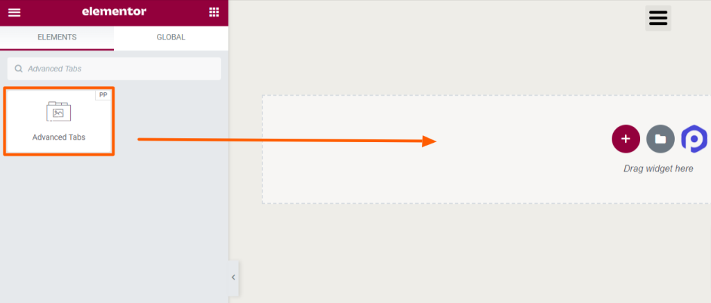
Next, search for the “Advanced Tabs” in the widget area, and drag & drop the widget on the page.
Don’t forget to check for the PowerPack “PP” sign on the top-right corner of the widget.
Content Tab of Advanced Tab Widget
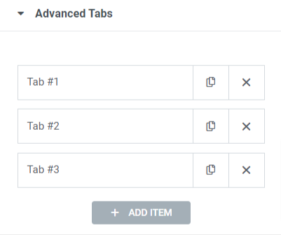
The content tab of the Advanced Tabs widget includes two sections:
- Advanced Tabs
- Layout
Let’s look at these sections in detail.
Advanced Tabs
Let’s look at the available features in this section:
- You can add as many “Tabs” as you want. Simply click to “Add Item” to create more tabs.
- You can customize each tab individually.
- Content-Type: This option allows you to choose multiple content types such as content, image, link(video/image), saved section, saved widget, and saved page template.
“Content” as the content type
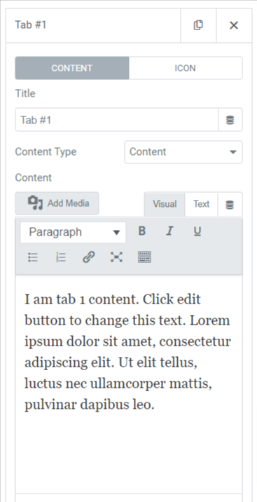
When you want to display content, you can customize these options:
- Title: Write a title for the content using this option.
- Content: In this section, you can add content to the tab with features like a number list, bullet list, link, bold, italic, underline, and many other features to style the text. In addition to that, you can also add an image from the media library.
“Image” as the content type
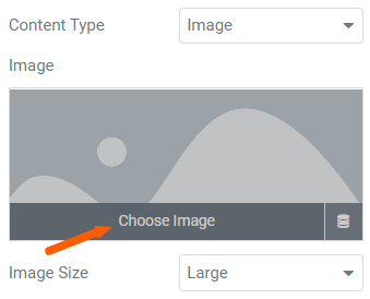
When you want to display an image, you can customize these options:
- Choose Image: Choose an image from the image library using this option.
- Image Size: This option allows you to select your desired image size.
When you want to display a link, then you can drop a link to the “Link” option. And if you choose a saved section, saved widget, or saved page template, you can select them accordingly.
As you customize the content part separately for each tab, you can do so for the icons of each tab.
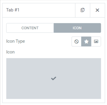
The features of the icon section are:
- Icon Type: You can choose an icon type, an icon, or an image. It may be the logo of your brand or any other thing.
- Icon: You can choose an icon from the icon library.
Layout
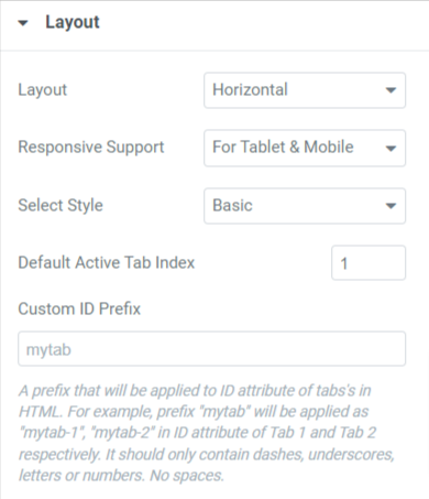
Let’s look at the available features in this section:
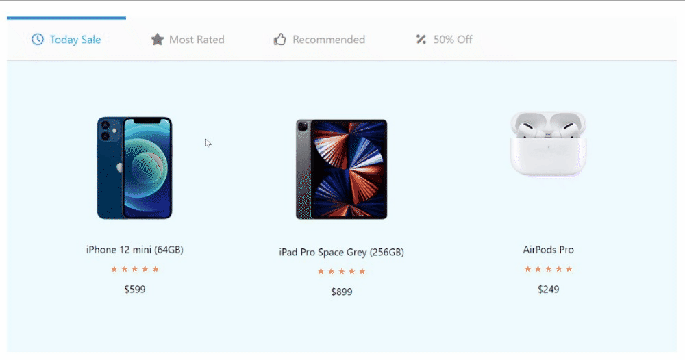
- Layout: You can select the layout as either a horizontal or vertical pattern.
- Responsive Support: Advanced Tabs widget supports responsive mode on all devices, whether desktop, tablet, or mobile.
- Select style: Select the tab style using this option.
- Scroll To Top: When clicking on the title, you can select yes or no on whether you want to scroll to the top of the tabs.
[Note: This option will be available only if you select a vertical layout pattern for the tabs.]
- Default Active Tab Index: This option can set the default active tab. So that whenever you visit your website, the tab you’ve selected will appear by default.
- Custom ID Prefix: You can add a custom ID prefix that’ll be applied to the tab’s ID attributes in HTML.
Apply these changes to your Advanced Tabs widget to see the best results.
Style Tab of Advanced Tab Widget
The style tab of the advanced tabs widget includes two sections:
- Tabs
- Title
- Content
Let’s look at these sections in detail.
Tabs
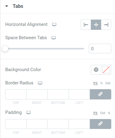
Let’s take a look at all the features included in this section:
- Horizontal or Vertical Alignment: Select the alignment for the tabs using this option, but choose the layout first.
- Space Between Tabs: Customize the spacing between the tabs with this option.
- Background Color: Using this option, you can choose a background color for the tabs.
- Border Radius: Apply border radius to display the curvy edges on the tab border.
- Padding: Adjust the padding for the tab to maintain spacing between the tab border and the content.
Title
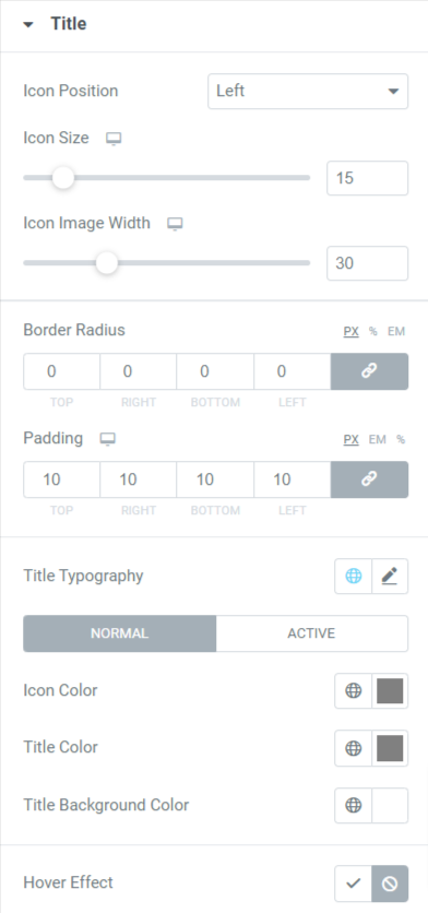
Let us take a look at the features included in this section:
- Icon Position: Choose an icon position to either top, bottom, right, or left.
- Icon Size: Adjust the icon size with this option.
- Icon Image Width: Adjust the icon image width using this option.
- Border Radius: Apply border radius to display the curvy edges on the tab title border.
- Padding: Adjust the padding for the tab to maintain spacing between the tab title border and the content.
- Title Typography: Customize the title text typography using this option.
- Icon Color: Choose an icon color with this option.
- Title Color: Customize the title text color using the title color option.
- Title Background Color: If you want to display the background color to the title, you can choose a color background using this option.
- Hover Effect: This option gives you the flexibility to enable or disable the hover effect.
Content
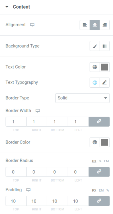
- Alignment: Set the content alignment displayed in the tabs using this option.
- Background Type: You can choose a classic or gradient background type.
- Text Color: Choose a text color for the content you want to display on the tabs.
- Text Typography: You can customize the typography of the content text using this option.
- Border Type: Choose a border type for the content from available options such as solid, double, dotted, dashed, or groove.
- Border Width: The border width applied to the content can be adjusted by this option.
- Padding: Adjust the padding to allow spacing between content text and its border to make it look organized and clean.
- Border Color: Content border color can be customized using this option.
- Border Radius: If you’ve applied a border to the content part, you can adjust its radius using this option.
So, that was all about customizing the content and style tab of the Advanced Tabs widget for Elementor by PowerPack Addons.
Install, activate, and make some changes according to your choice; it’s as simple as that.
Get PowerPack Advanced Tabs for Elementor Page Builder
After knowing about all those features of the Advanced Tabs widget provided by PowerPack Elementor Addons, we’re sure you’ll love using it on your website. We hope this tutorial helped you create stylish “tabs” for your website using the PowerPack Advanced Tabs widget.
Widgets by PowerPack Addons are amazingly designed by our creative coders so that non-coders can use them easily in minutes. Click here to get the PowerPack Advanced Tabs widget and enhance your website’s look and user experience.
If you’ve enjoyed reading this article, you’d also love to experience our other PowerPack elements.
Please drop your comments here; we’d love your replies. Also, join us on Twitter, Facebook, and YouTube.
