Looking for a way to create logo sliders on your WordPress website using Elementor?
Showcasing client logos on your website is an excellent way to build credibility and trust with potential customers. Displaying partner brands, sponsors, or featured clients in a well-designed logo grid or slider can enhance your site’s professionalism and user experience.
In this guide, we’ll walk you through the step-by-step process of creating a logo grid and slider in WordPress using Elementor and the PowerPack Addons plugin.
Why Add a Logo Grid or Slider to Your Website?
Adding a logo grid or slider to your website boosts credibility by showcasing reputable brands, helping visitors feel more confident in your business. It also enhances the aesthetics of your site by providing a visually appealing way to present logos.
A slider is a space-saving solution, allowing multiple logos to be displayed without overwhelming the page. Additionally, interactive elements like sliders encourage user engagement and enhance the overall user experience.
Creating Logo Slider and Grid Using Elementor
PowerPack Addons for Elementor is one of the best addons for the Elementor page builder. It has over 80 handy widgets, including 150+ unique and stylish templates.
Every widget and template provided by PowerPack Addons is unique and powerful enough to deliver the best experience that lets your website function smoothly. In addition, these super lightweight widgets synchronize perfectly with your website performance and help you match essential SEO parameters.
To create a logo slider & grid on your website, you can use logo widgets provided by PowerPack Addons for Elementor, i.e., the PowerPack Logo Grid widget & PowerPack Logo Carousel widget.
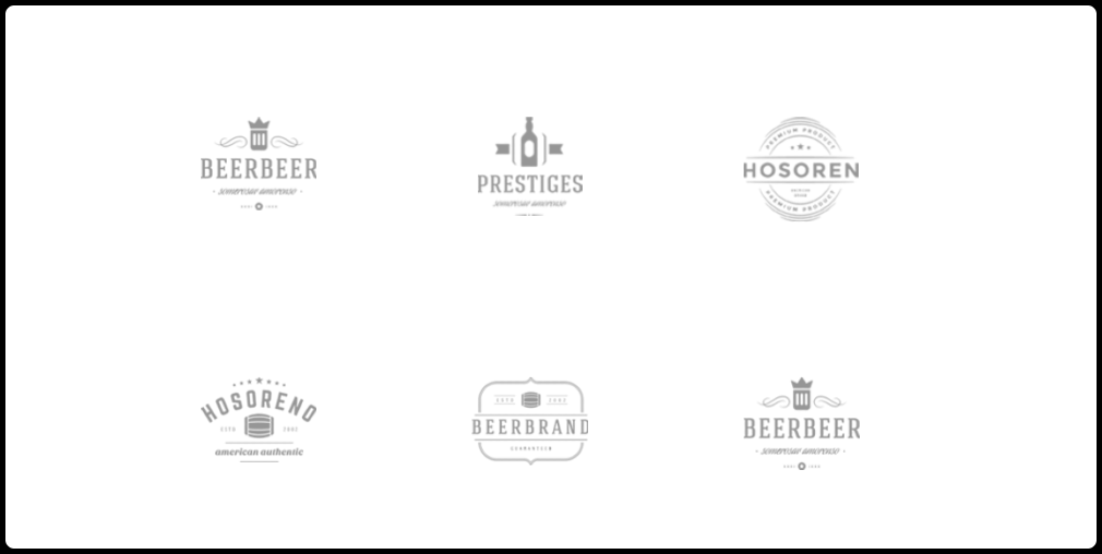
PowerPack Logo Grid Widget for Elementor
Using the PowerPack Logo Grid widget for Elementor, you can display logos of your partner brands, clients, sponsors, and many more in a unique & stylish way.
In addition, the widget offers multiple customization options for Elementor, allowing you to diversify your website’s overall look and feel.
Features of the Logo Grid Widget
- Add as many logos as you want.
- Advanced customization options to display the logo pattern of your choice.
- Custom styling effects like border, color, shadow, and many more.
- Supports multiple columns along with additional customization options like alignment, size, width, spacing, background color, opacity, grayscale, etc.
- Also, there’s a feature to set random orders for logos so that every time you visit the site, logos in the logo section will get shuffled; hence, every time, it feels new and fresh.
- In addition, each of these customizable features is applicable to normal and hover modes.
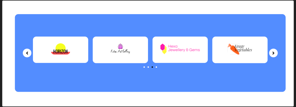
PowerPack Logo Carousel Widget for Elementor
PowerPack Logo Carousel widget for Elementor allows you to create interactive sliders for the logos of your clients.
Feature of the Logo Carousel Widget
- Multiple carousel effects.
- Advanced customized options for the logo slider.
- Additional customizable effects like typography, font color, type spacing, gradient background, grayscale filters, and many more.
- Multiple styles for pagination.
- Easy to use and responsive
Creating a Logo Grid in Elementor
Add the Logo Grid Widget to Your Page
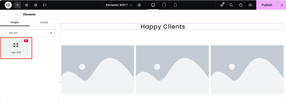
To display an interactive logo gallery on your WordPress website, first, you need to install and activate the Elementor Page Builder and PowerPack Addons.
Next, open the page using the Elementor editor, type “logo grid” in the search bar, and drag & drop the widget.
Make sure to check for the PowerPack “PP” sign on the top-right corner of the widget.
Content Tab of the Logo Grid Widget
Let’s see the features available in the logo grid section.
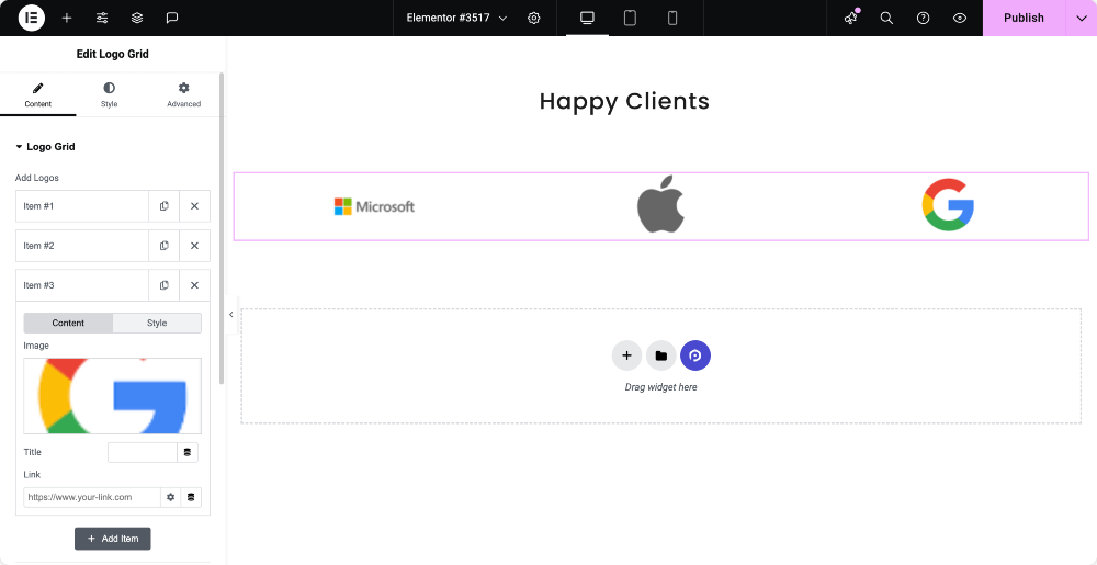
Logo Grid
Add Logos: You can add logo images here and customize them individually. After adding logo images, you can customize them by their content and style.
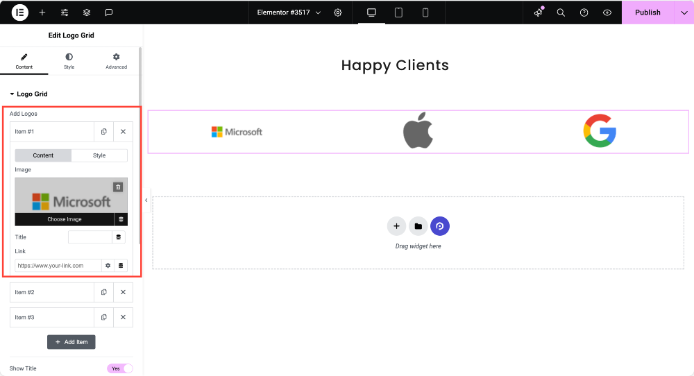
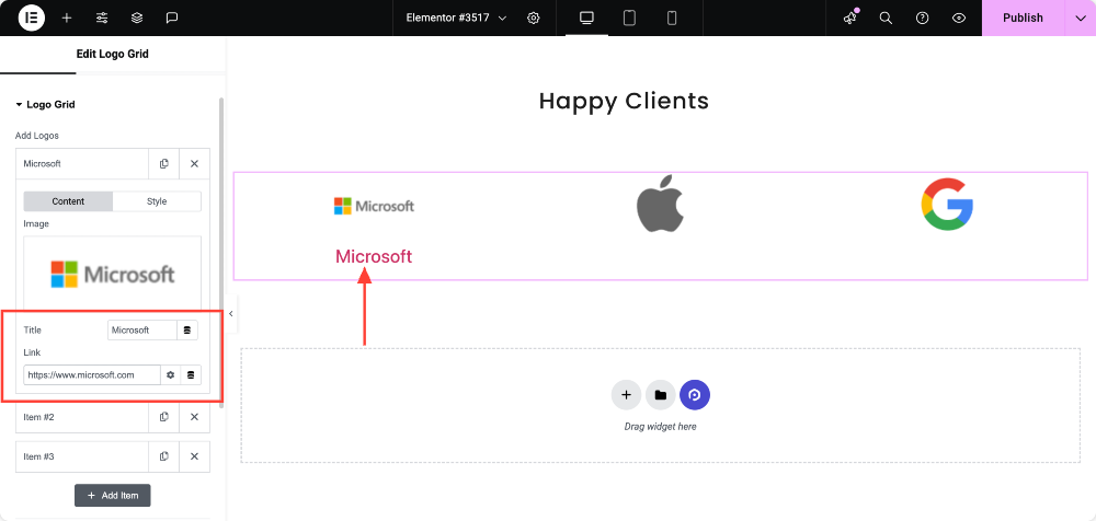
Customize Logo Content: Once you add logo images, you can add a title and drop a link.
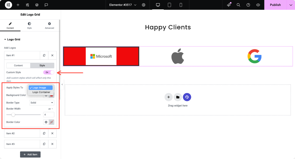
Customize Logo Images: You can customize the logo images individually by enabling the Custom Style option.
Once you enable this option, you’ll get options like “Background Color” and “Border Type.” Also, you can choose whether to make these changes to the Logo Container or Logo Image on the “Apply Styles To” option.
Remember, you have to apply these changes to every single item individually.
Other Customizing Options
- Title HTML Tag: This option can select the logo title HTML tag.
- Randomize Logos: Enabling this option will allow logos to display randomly on the screen.
- Columns: You can choose columns for logos using this option.
- Logos Gap: Gaps between the logos can be adjusted with this option.
- Vertical Align: Use this option to set the vertical alignment of logos you’ve displayed.
- Horizontal Align: Use this option to set the horizontal alignment of logos you’ve displayed.
- Image Size: Choose the image size using this option.
- Image Width: You can adjust the image width with this option.
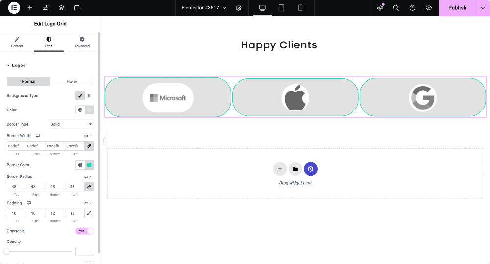
Style Tab of the Logo Grid Widget
Let’s see the available options in the Style tab:
- Background Type: You can choose a background type for the logo grid section, such as classic or gradient.
- Border Type: Choose a border type for the logo grid from options such as solid, double, dotted, dashed, and groove.
- Border Radius: Set the border radius if you’ve applied the border to the border grid. It’ll allow the border edges to look curvy and smooth.
- Padding: Adjust the padding to allow spacing between the grid and the border.
- Grayscale: Enabling this feature will allow your grid to look tinted.
- Opacity: Set the logo grid opacity using this option.
- Box Shadow: If you want to apply a box shadow to the logo grid, choose this option. This fantastic feature will allow a shadow effect on the two adjacent sides of the logo grid.
So, this was all about using the Logo Grid widget for the Elementor page builder. Now, let’s proceed to the second part of this tutorial, i.e., Creating a Logo Slider in Elementor.
Creating a Logo Slider in Elementor
First, type the “logo carousel” in the search bar and drag & drop the widget on the Elementor editor page. Make sure to check the “PP” sign on the top-right corner of the widget.
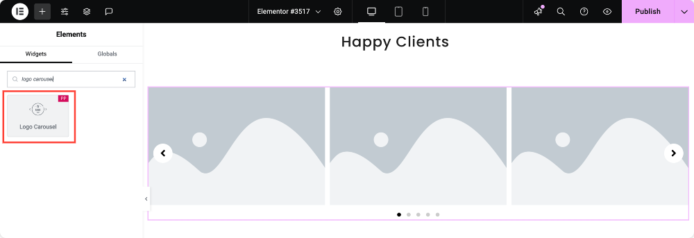
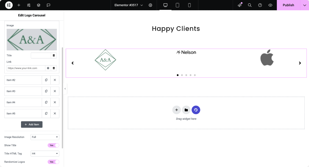
Content Tab of the Logo Carousel Widget
Content Tab of the logo carousel widget consists of two sections:
- Logo Carousel
- Carousels Settings
Let’s see each of these sections one by one.
Logo Carousel
Let’s see the options available in this section:
- Image: This option allows you to add logo images, choose logo images, and upload them from the media library. Also, you can customize the added images by adding their title and dropping a link.
- Image Resolution: Adjust the logo image using this option.
- Title HTML Tag: Set the logo title HTML tag with this option.
- Randomize Logos: Enabling this option will allow logos to display randomly on the screen. So that every time you visit your site, the logo section will appear refreshed and new.
Carousel Settings
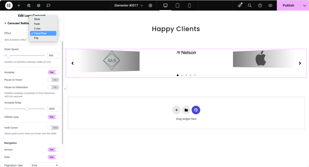
Let’s see the available options in this section:
- Effects: Choose what effect you want to apply to your logo section from the options such as slide, fade, cube, coverflow, or flip.
- Visible Items: You can choose the number of items(logos) you want to display at a time.
- Items Gap: Adjust the logo gap using this option.
- Slider Speed: You can adjust the slider speed with this option.
- Autoplay: Toggle on this option if you want to apply the autoplay feature to the logo carousel.
- Pause on Hover: Enable this option if you want to apply a pause effect whenever the cursor hovers over the logo carousel.
- Pause on Interaction: Enabling this option will disable the autoplay feature, and the carousel pauses on the user’s first interaction.
- Autoplay Delay: Set the autoplay delay time if you’ve allowed the autoplay effect to the carousel.
- Infinite Loop: Toggle on this option if you want to apply an endless loop to the carousel.
- Grab Cursor: Enabling this option will show a grab cursor when anyone hovers over the slider.
Navigation
- Arrows: Toggle on this feature if you want to display the arrows on either side of the logo section.
- Dots: Toggle on this feature if you want to display dots in the logo section.
- Pagination Type: Choose the pagination type for the carousel you want to apply to your logo slider. You can choose either ‘dots’ or ‘fractions.’
Style tab of the Logo Carousel Widget
Style tab of the logo carousel widget consists of four sections:
- Logos
- Title
- Arrows
- Pagination
Let’s see them all one by one.
Logos
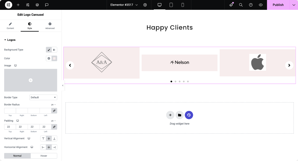
Let’s see all the available options in this section:
- Background Type: You can customize the background type of the logo by choosing either the ‘classic’ or ‘gradient’ options for the logos you’ve added.
- Border Type: Apply a border to the logos you’ve added using this option.
- Border Radius: The border-radius of the logos can be adjusted using this option.
- Padding: You can adjust the padding for logos with this option.
- Vertical Alignment: Set the vertical alignment at the logos’ top, center, or bottom.
- Horizontal Alignment: Set the horizontal alignment at the logo’s top, center, or bottom.
- Grayscale: Apply grayscale to the logos if you want to display a tinted shade in the logo section.
- Opacity: You can adjust the opacity of the logos using the opacity option.
Title
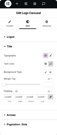
Let’s see the available options in this section:
- Typography: You can customize the logo title using the typography option.
- Text Color: Choose a text color for the logo title here.
- Background Type: You can choose a background type, either classic or gradient, for the logo title.
- Margin Top: Adjust the margin-top of the logo title by using this option.
- Padding: Adjusting the padding for the logo title will allow spacing for the same to be displayed.
Arrows
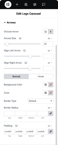
Let’s see all the available options in this section:
- Choose Arrow: Choose an arrow icon from the icon library to display on the logo slider.
- Arrow Size: Set the arrow size here.
- Align Left Arrow: Set the alignment of the left arrow using this option.
- Align Right Arrow: Set the alignment of the right arrow using this option.
- Background Color: Using this option, you can choose a background color for the arrow.
- Color: You can set a color for arrows here.
- Border Type: Choose a border type for the arrows from available options such as solid, dotted, doubled, dashed, and groove.
- Border Radius: Adjust the border-radius if you’ve applied the border.
- Padding: Adjust the padding for arrows, allowing the arrows to look clean and customized.
Pagination: Dots
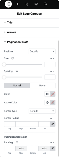
Let’s see the options available in this section:
- Position: You can choose the position for the pagination, either place it inside the logo slider or outside the logo slider.
- Size: Adjust the size of the pagination dots.
- Spacing: Adjust the spacing between the dots.
- Color: Customize the pagination dots’ color using this option.
- Active Color: Choose a dot color for the active page.
- Border Type: You can use this option to apply a border to the dots.
- Border Radius: Adjust the border-radius if you’ve applied the border to the pagination dots.
- Padding: Adjust the padding for the dots using this option.
Note: You’ll get this option only when you choose “dots” pagination as the pagination type on the carousel settings section.
Pagination: Fraction
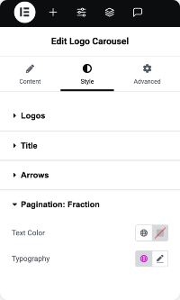
This section allows you to customize the “Text Color” and the “typography” of the fraction pagination for the logo slider. Use these options as per your preference.
Note: You’ll get this option only when choosing “fraction” pagination as the pagination type on the carousel settings section.
So, this was the detailed tutorial on creating a Logo Slider & Grid in WordPress using Elementor page builder and PowerPack Addons for Elementor.
Once you make all these changes to your “logo grid section” & “logo carousel” section, you’ll get something like this:

Final Words!
We hope this tutorial blog helped you create trendy “tickers” for your website using the PowerPack Content Logo Grid & PowerPack Logo Carousel widget.
If you’ve enjoyed reading this article, you’d also love to experience our other PowerPack elements.
We messed up with dozens of codes, so you can enjoy our PowerPack Elementor Addons without being puzzled by code.
Click here to get the PowerPack Logo Grid widget for Elementor.
Click here to get the PowerPack Logo Carousel widget for Elementor.
Please feel free to drop your comments here; we’d love to receive your replies. Also, join us on Twitter, Facebook, and YouTube.
