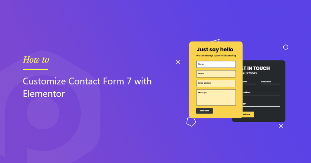
Looking for a simple way to customize your Contact Form 7 with Elementor?
Contact Form 7 is one of WordPress’s oldest and most popular contact form builders. You can measure its popularity by seeing that the lite version of the Contact Form 7 has 5+ active installations & 1000+ 5-star ratings to date.
Though Contact Form 7 included all the advanced and necessary features required in a form builder plugin, customizing its styling settings is tricky for beginners, and it doesn’t come with any built-in styling customization features.
So, in this article, we’ll show you how to style Contact Form 7 with the Elementor page builder without adding any custom code or HTML CSS.
Before we start, let’s get an answer to a basic question.
Can You Use Contact Form 7 With Elementor?
Yes, using the third-party plugins, you can easily use Contact Form 7 with the Elementor page builder.
There’s no in-built feature of the Contact Form 7 plugin that allows you to integrate it directly with Elementor, but by using the addons, such as PowerPack for Elementor, you get the flexibility to use, style & embed Contact Form 7 in the Elementor live editor.
PowerPack is one of the best elementor addons present in the market. It has many creative and advanced widgets, including the form styler widgets for popular WordPress plugins.
The Contact Form 7 form styler widget of PowerPack lets you customize your forms without any hustle and bustle. This form styler widget has amazing styling features and functionality that lets you style every element of your contact form in just a few clicks.
Let’s see how you can use the PowerPack form styler widget to style Contact Form 7 on your WordPress website using Elementor.
How to style Contact Form 7 With Elementor
Before we start, make sure you have installed and activated these plugins on your WordPress site:
If you prefer watching a video guide, check out the video below for detailed instructions on the tutorial.
Build a Form Using Contact Form 7 Plugin
Once you activate all the plugins mentioned above, you must create a form using Contact Form 7. Check out the doc getting started with Contact Form 7 for more information.
Create a New Page or Edit an Existing Page in Elementor Editor
Now that you have created your form, you need to add a new page or edit the existing one and open it in the elementor editor.
Drag and Drop the PowerPack Contact Form 7 Style Widget
Once you have opened the page, search for “contact form 7” in the search bar and drag & drop the widget on the page.
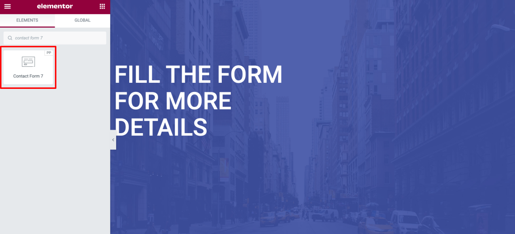
Make sure to check for the PowerPack “PP” sign on the top-right corner of the widget.
Customizations in the Content Tab of the Contact Form 7 Styler Widget
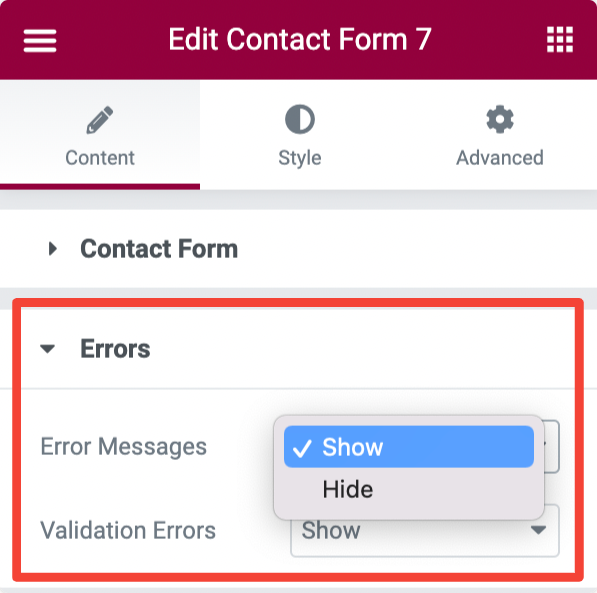
The Content Tab of the PowerPack Contact Form 7 widget consists of 2 sections: Contact Form & Errors.
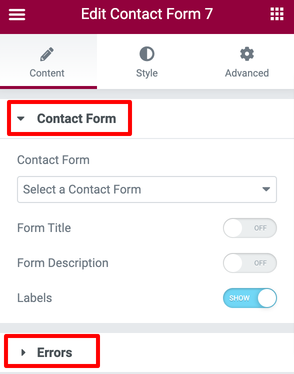
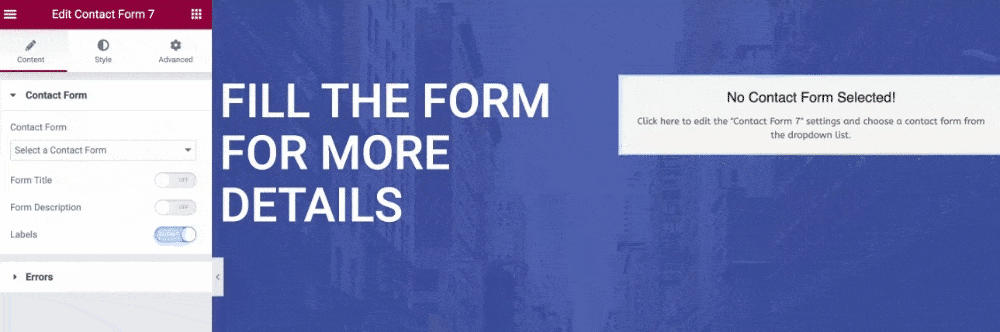
Select Your Contact Form
The first thing you need to do is select your Contact Form 7 from the drop-down menu. As soon as you choose the form, it will appear immediately in the editor.
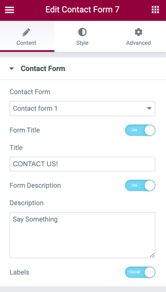
Add Customized Form Title and Description
As you can see in the above video, the form includes default fields and options. With PowerPack Contact Form 7 styler widget for Elementor, you get plenty of options to style & customize these options as you like.
You can add an attractive and custom title and description to your form from the Content Tab.
Also, if you want, you can hide or show the form Title, Description, and Labels by simply clicking the toggle button.
Show/Hide Error and Validation Messages
Using the Errors subsection, you can easily display an error and validation message to your form users.
Customizations in the Style Tab of Contact Form 7 Styler Widget
The Style Tab of the Contact Form 7 styler includes styling options to customize the look and appearance of your contact form.
Let’s see what customization options you get here:
Style Form Title & Description
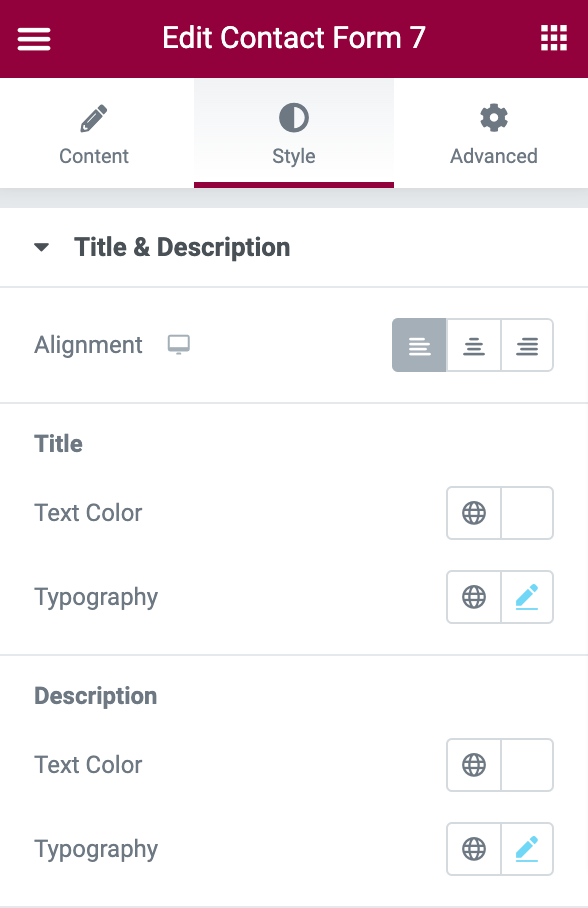
The first section in the Style Tab is Title and Description, and as the name indicates, here, you get options to give styling to the form title and description. You can:
- set form title and description’s alignment to left, center, and right.
- change title, text color, and typography.
- change the description text color and typography.
Styling Options for Input & Textarea
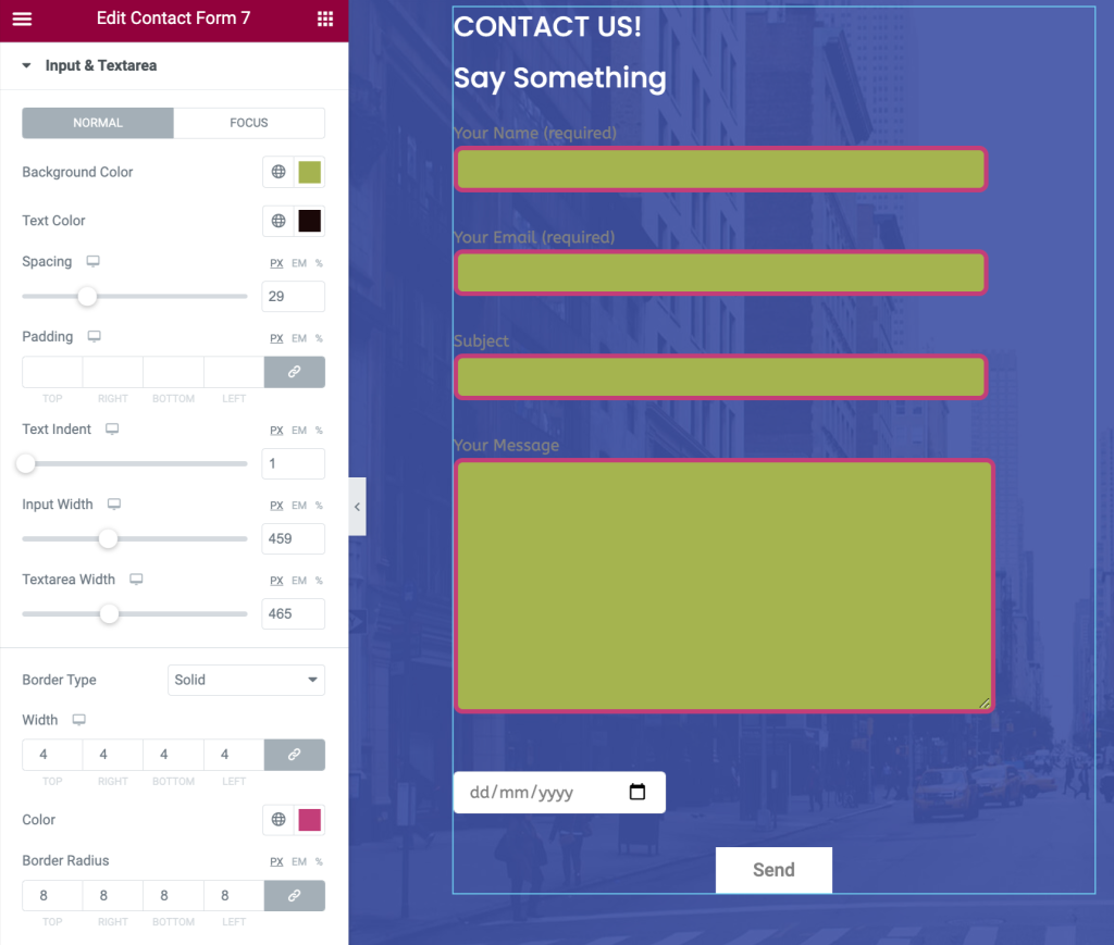
Form Input Fields and Textarea are generally ignored by the site owners when it comes to styling options. But the PowerPack form styler widget allows you to effortlessly style Contact Form 7 input fields and textarea.
Here, you get options to:
- add background & text color
- adjust the spacing between fields
- set text-indent for input fields
- add a border and select border radius and color
- Alter typography for text inputs
- and many more.
Customize Placeholder
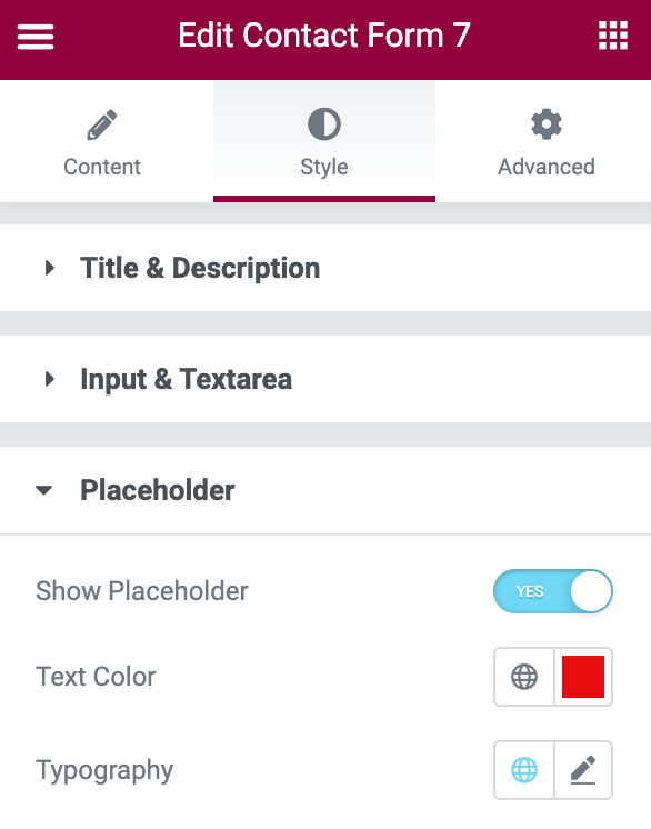
In the following subsection, you can customize the form placeholder text. You can show/hide the placeholder text by toggling on/off the button.
Further, you can change the placeholder text color and customize the typography.
Style Radio and Checkbox
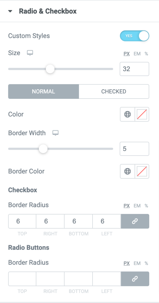
With the PowerPack Contact Form 7 styler widget, you can add custom styling to the Radio & Checkbox button.
First, toggle on the Custom Styles button from the Radio & Checkbox section to add a custom style.
You will be displayed with the radio and checkbox button’s styling options as soon as you enable the button.
Here, you can choose the size and color for the button. Also, to make your form design more attractive, you can add a border to your radio and checkboxes.
Customization Options for Error and Validation Message
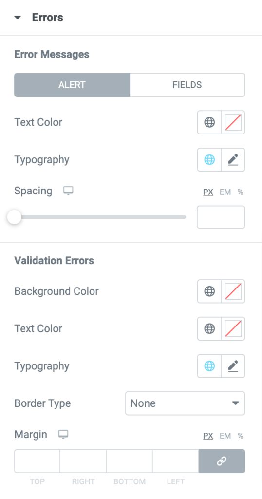
PowerPack Contact Form 7 styler widget allows you to display an error message and gives you plenty of options to add styling to it.
You can style errors and validate messages by altering typography, adding background and text color, and setting up borders and margins.
Style Contact Form 7 Submit Button
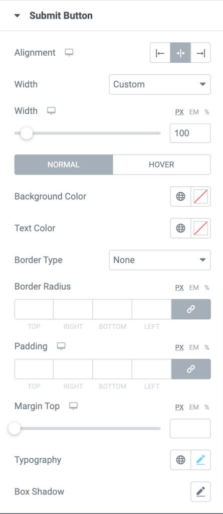
The submit button is one of the most important elements of any contact form, and with the PowerPack widget, you can style the submit to make it more eye-catching. Here, you get styling options to:
- set alignment of the submit button to the left, right, and center
- choose the submit button width
- add background and text color
- adjust border radius and padding
- customize typography by choosing a font, text size, text style, and more
- and many more
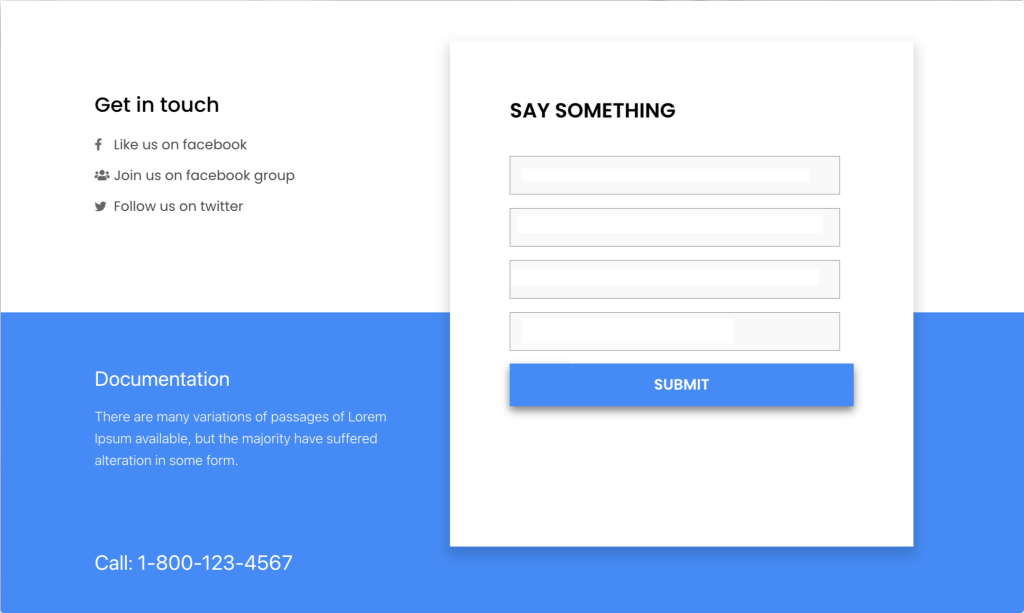
Final Outcome: Customized Contact Form 7
This is somehow your contact form looks fully designed and styled.
Get PowerPack Contact Form 7 Style Widget for Elementor
This is how simple it is to style Contact Form 7 using Elemntor and PowerPack. I hope this tutorial helps you create beautiful contact forms on your WordPress websites.
PowerPack Elementor addons come with 80+ creatively designed elementor widgets and 200+ pre-made page and section templates.
These widget packs help you create advanced Elementor websites without any coding. Click here to get PowerPack now!
If you like this tutorial, please share your comments in the comment section below.
