
Are you searching for a simple way to create an accordion using Elementor? This post has got you covered!
Accordions are the best element to display information on your web pages if you’ve limited space.
In this article, we’ll show you how to add interactive accordions on your WordPress websites using Elementor and PowerPack Addons.
So let’s get started!
What Is Accordion?
Accordion is a collapsible content panel that allows users to independently expand and collapse multiple content sections. It typically consists of collapsible panels stacked vertically, with each panel containing its own content and a toggle button or link to expand or collapse that section.
Depending on the accordion’s settings, when one section is expanded, others collapse automatically. Accordions are the best tools for organizing and presenting structured content, such as FAQs or categorized information, in a compact and easily navigable format.
Create an Accordion Using Elementor With the PowerPack Advanced Accordion Widget
Let’s start creating an accordion using the Elementor and PowerPack Advanced Accordion widget.
PowerPack Advanced Accordion widget does exactly what its name says: It lets you add interactive and advanced accordions to your web pages. And worry not—you don’t have to write a single line of code to carry out the functions in your accordion.
The best feature of the PowerPack Accordion widget is that it lets you easily switch between the Toggle and Accordion elements displayed on your page. So, in one widget, you get the functionalities of two tools—impressive… isn’t it?
Additionally, you get many styling options that help you customize your accordion. These options include everything from margin and padding to typography and color!
So, without further discussion, let’s learn how to create an accordion for your Elementor websites.
1. Install and Activate PowerPack Addons
Before we begin, ensure you have Elementor Builder and PowerPack Elementor addon installed and activated.
2. Create a New Page
Once you’ve installed and activated these plugins, you must create a new page by heading to your WordPress Dashboard >> Pages >> Add New.
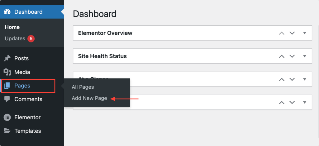
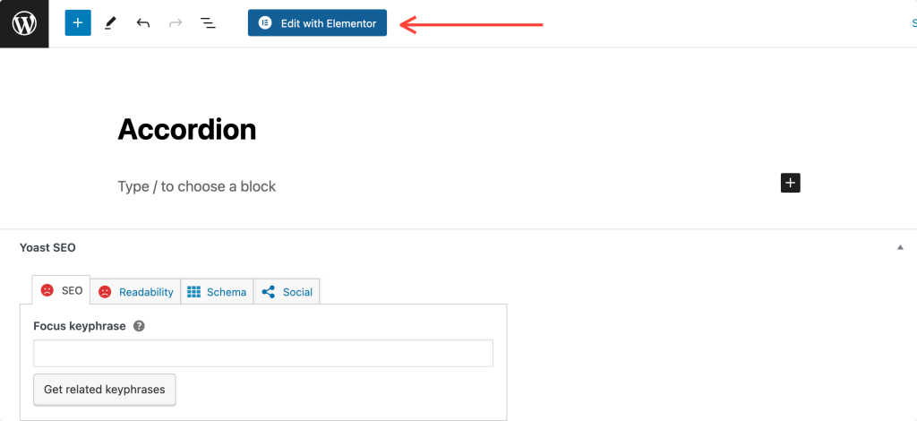
Next, click on the “Edit with Elementor” button.
3. Drag and Drop the PowerPack Advanced Accordion Widget
As soon as you click on “Edit with Elementor,” the Elementor editor will open. Next, search for “advanced accordion” in the widget panel.
When the widget appears, drag and drop the advanced accordion widget into the Elementor editor. Make sure to check the “PP” icon at the top-right corner of the widget.
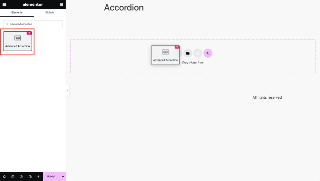
The screenshot below shows how your page looks after adding the Advanced Accordion widget.
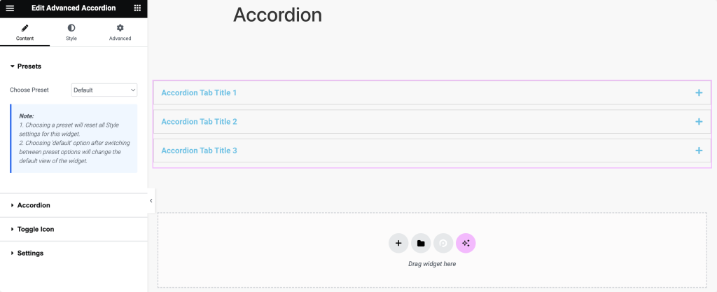
4. Define Accordion Content
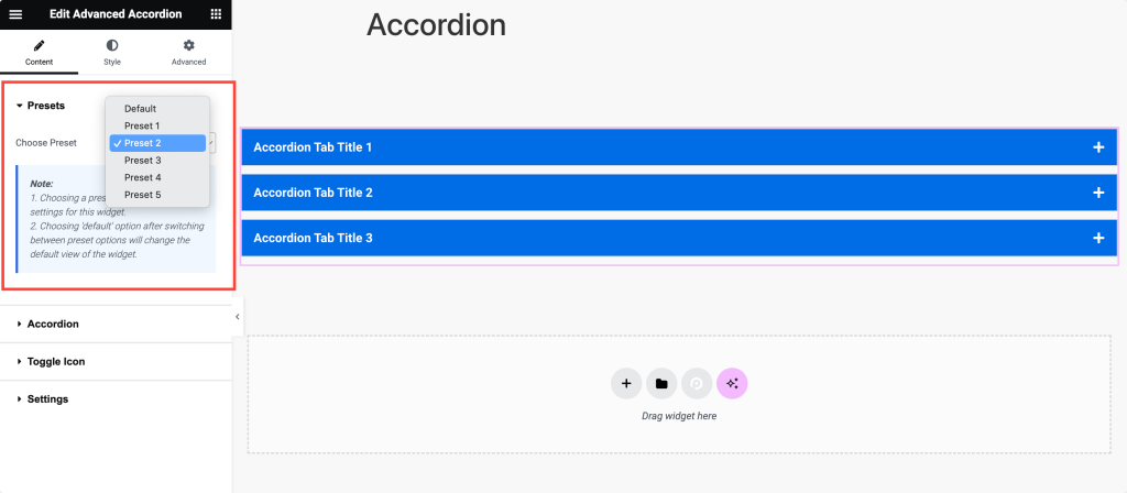
The first tab you’ll see is the Presets. From here, you can choose a preset design from the available options that best suits the style you want for your accordion. Alternatively you can design your accordion from scratch also.
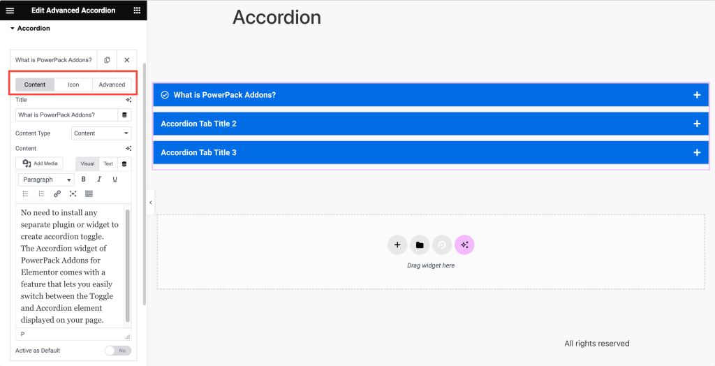
Moving forward, click on the “Accordion” tab to begin configuring the content and appearance of your accordion sections.
In the “Content Sub-tab,” the first thing you need to do is enter the titles for each accordion section. These titles will serve as clickable headers to expand and collapse the content.
Then, select the type of content you want to display within each accordion section from the “Content-Type” dropdown. You can choose between text, images, or even saved sections, widgets, or page templates.
Afterward, proceed to the “Icon Sub-tab,” where you’ll choose icons for your accordion sections.
Select an icon from the dropdown to represent each accordion section. This icon will visually indicate whether the section is expanded or collapsed.
Optionally, if you need to apply custom styling or scripting, you can move to the “Advanced Sub-tab” and assign custom CSS IDs to specific accordion sections.
5. Select Toggle Icon
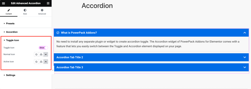
Moving on, navigate to the “Toggle Icon Tab” to configure the appearance of the toggle icons used for expanding and collapsing accordion sections.
Enable the toggle icons if you want them to appear alongside the accordion titles. Then, choose the icon to display in its default (uncollapsed) state from the “Normal Icon” dropdown.
Similarly, select the icon to display when the accordion section is expanded (active) from the “Active Icon” dropdown.
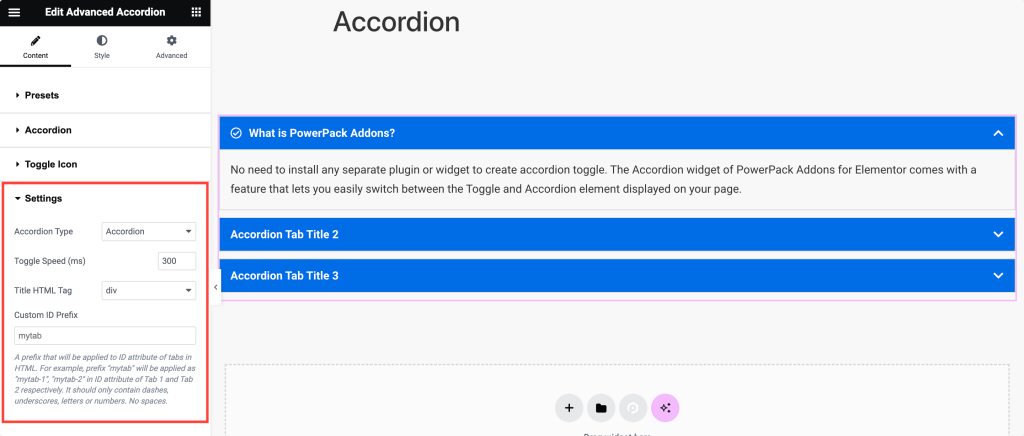
6. Choose From Settings Options
Finally, head to the “Settings Tab” to adjust your accordion’s general settings and behavior.
Select the desired “Accordion Type” – either “Accordion” or “Toggle” depending on whether you want only one section open at a time or multiple sections to remain open simultaneously.
Set the “Toggle Speed” to specify how quickly accordion sections expand and collapse for smoother transitions.
To ensure proper SEO and accessibility, select the HTML tag used for the accordion titles from the “Title HTML Tag” dropdown.
Optionally, if you need custom IDs for styling or scripting purposes, enter a “Custom ID Prefix” to automatically generate custom IDs for accordion sections.
7. Style Your Accordion
Once you finish the content customization, move to the Style tab.
In the Style tab, you’ll find every nifty option to style your accordion. Let me break down each section’s options so you can explore them easily:
Items
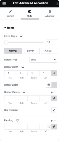
- Item Gap: First, adjust the spacing between each accordion item. This ensures that there is enough space between each section.
- Border Type, Width, Color, and Radius: Next, determine the border’s appearance around accordion items. Choose the type, width, color, and curvature of the corners to suit your design preferences.
- Box Shadow: Apply a shadow effect to accordion items if you want to add depth and dimension to your accordions.
- Padding: Specify the padding around the content within each accordion item. This controls the spacing between the content and the border of the accordion item.
Title
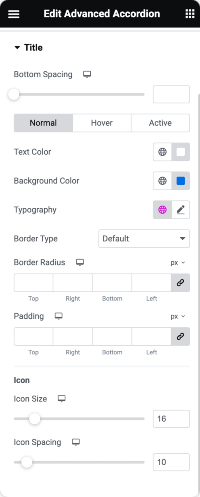
- Bottom Spacing: Set the spacing between the accordion title and the content below for better visual separation.
- Text Color and Background Color: Choose the color of the text and the background behind the accordion titles to match your website’s color scheme.
- Typography: Customize the font style, size, weight, and other typography settings for accordion titles to ensure consistency with your overall design.
- Border Type, Radius, and Padding: Similar to the items tab, you can also add borders around accordion titles, adjust their curvature, and specify padding for better spacing.
- Icon Size and Spacing: If you use icons following accordion titles, adjust their size and spacing to ensure they complement the text properly.
Content
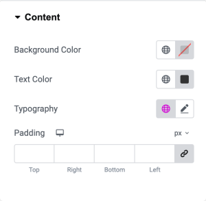
- Background Color: Set the background color of the accordion content area to distinguish it from the rest of the page.
- Text Color and Typography: You can choose the color of the text within accordion content and customize its typography settings for readability and consistency.
- Padding: Specify the padding around the content within each accordion section to ensure proper spacing and alignment.
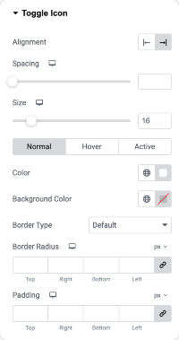
Toggle
- Alignment and Spacing: For optimal visual balance, align the toggle icons within accordion titles and adjust the spacing between them and the text.
- Size and Color: You can customize the size and color of the toggle icons to make them stand out or blend in with the accordion titles.
- Background Color, Border Type, Radius, and Padding: To add additional styling to the toggle icons, you can set their background color, border type, curvature, and padding as needed.
Using the Advanced Accordion widget in Elementor, you can create visually appealing and well-designed accordions by configuring each styling option according to your preferences.
Wrapping Up!
We are sure this tutorial helped you easily create accordions on your Elementor. The PowerPack Addons for Elementor allow you to do a lot more. There are more than 70 creative widgets that you can use to customize your Elementor pages.
If you face any difficulty following the steps mentioned in this article, please feel free to connect with us or drop your queries in the comment section.
What are your thoughts on this tutorial? Do share if you found this helpful guide! Also, join us on Twitter, Facebook, and YouTube.
FAQs: PowerPack Accordion Widget for Elementor
Here are some frequently asked questions that you might have:
An accordion is a collapsible content panel that allows users to expand and collapse sections of content. It’s beneficial for displaying FAQs or organizing large amounts of information in a compact space.
To create an accordion in Elementor, you can use the Advanced Accordion widget from PowerPack Addons. This widget lets you add interactive and customizable accordions to your web pages without coding.
No, with the Advanced Accordion widget from PowerPack Addons, you can create and customize accordions without writing any code.
Yes, the Advanced Accordion widget offers various styling options, including margin, padding, typography, and color, allowing you to match the accordion’s design to your website’s existing design and layout.
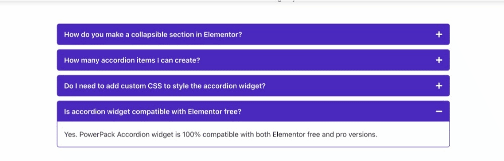
Yes, the Advanced Accordion widget from PowerPack Addons is compatible with both the free and pro versions of Elementor.
Yes, the Advanced Accordion widget allows you to include various content types within each section, such as images, saved sections, saved widgets, or saved page templates.
In an accordion, only one section can be open at a time; opening a new section closes the previous one. On the other hand, toggles allow multiple sections to be open simultaneously.
To keep all accordion items closed by default, adjust the widget’s settings accordingly. For detailed instructions, refer to this doc: how to keep an accordion item closed by default.
You can open a specific accordion item by adding a custom URL parameter. For more details, refer to this doc: how to target accordion items to open by URL.
