Have you ever wanted to create a website that looks great on any device? Responsive web design allows you to do just that.
A responsive theme will automatically change your website to match any screen size, ensuring that your content appears fantastic regardless of how your visitors view it.
In this article, you’ll learn how to find the perfect responsive theme to create a professional, beautiful, and user-friendly WordPress website.
Why Should You Choose a Responsive WordPress Theme?
Responsive, mobile-friendly sites are likely to receive more visitors than non-responsive sites.
Nowadays, more and more people are accessing the internet on mobile devices compared to desktops. Mobile browsers render websites differently than desktop browsers.
Responsive WordPress themes ensure your site is viewable and functional on all devices.
How to Choose the Best Responsive Theme for Your WordPress Website
The design of a website is critical to the success of any online business enterprise.
A website that is not responsive on all devices will likely generate fewer visitors and sales. Choosing a responsive WordPress theme for your website is critical to ensuring it is functional and visually appealing across all devices.
The easiest way to determine if a WordPress theme is responsive is to test it yourself. If you’re using a responsive WordPress theme, you can resize your browser window to see how it will display.
Additionally, you can use a WordPress theme testing service to do this for you. You’ll need to input your website’s URL and browser to do this. You can also use an online tool like PageSpeed Insights to test your website.
Features You Need to Look at While Choosing a WordPress Theme
✅ Easy Setup
The WordPress theme you choose should be simple and easy to set up. Ideally, setting up or core content editing should require no additional functionality. If you find this difficult, setting up your website will take twice as long, and you may need to hire a developer.
✅ Wider Image and Video Placement
Choose a WordPress theme allowing a large image and video placement on the homepage and throughout the website. These images and videos should be able to scale to fit the most prominent image size on your website and the width of the smallest viewable size.
✅ Visual Appeal
Your WordPress theme should have a visually appealing color scheme and design. It should also have simple & easily understandable call-to-action buttons, attractive fonts, and appealing imagery.
✅ Mobile-Friendly
Your WordPress theme should be compatible with all devices, regardless of the operating system. In addition, it should be mobile-friendly, meaning it displays correctly on smartphones and tablets, regardless of screen size.
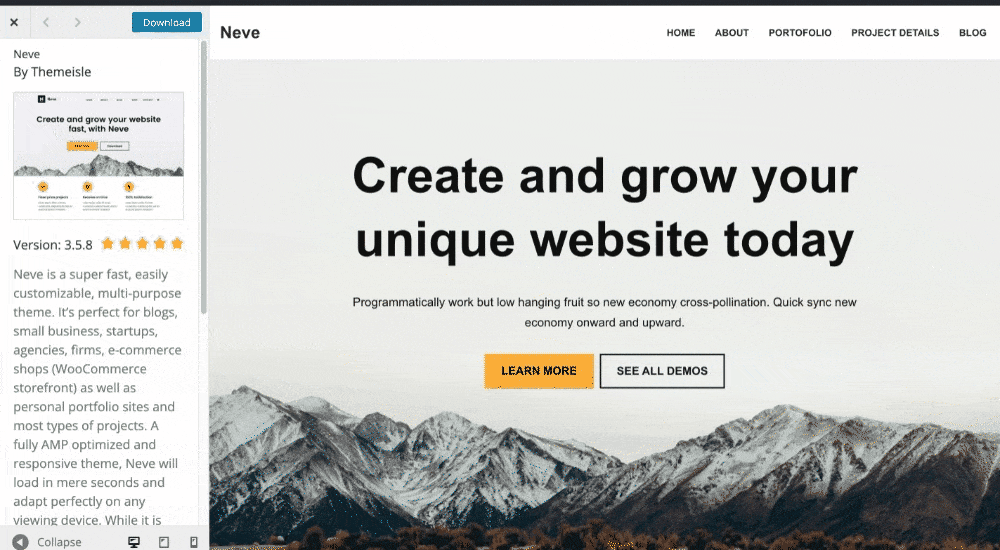
✅ Live Preview
It’s a good idea to test how your WordPress theme looks on different devices. Many WordPress themes allow you to view how your site will look in real-time and see how it will display on various devices.
Tips for Choosing the Responsive WordPress Theme
- Read the reviews of the best WordPress themes available to see if anyone has reported a non-responsive theme.
- Pick a WordPress theme that is visually appealing to visitors.
- Choose a WordPress theme with a color scheme that appeals to your target audience.
- Pick a WordPress theme with images and icons representative of your business.
- Choose a WordPress theme with a visually appealing design that inspires your visitors.
- Choose a WordPress theme that has a straightforward layout and navigational schema.
- Choose a WordPress theme that has a layout that is easy to navigate.
- Pick a WordPress theme that has a large homepage image and video.
- Choose a WordPress theme with a large image and video on the homepage and throughout the website.
- Pick a WordPress theme that has a horizontal layout.
- Choose a responsive WordPress theme with built-in support for more than one device.
- Choose a WordPress theme that has a modern design.
Wrapping Up!
Responsive themes make it easy to create a mobile-friendly website and have an optimized design for all devices.
Choosing the best responsive WordPress theme for your website requires careful consideration of the above features and qualities to ensure that your website is functional and aesthetically pleasing across all devices.
We hope our article helps you to choose the best WordPress theme for your website.
To read more related articles, you can subscribe to our newsletter.
Also, follow us on Twitter, Facebook, and YouTube to stay in touch with us and get more updates.
More From the Blog:
