
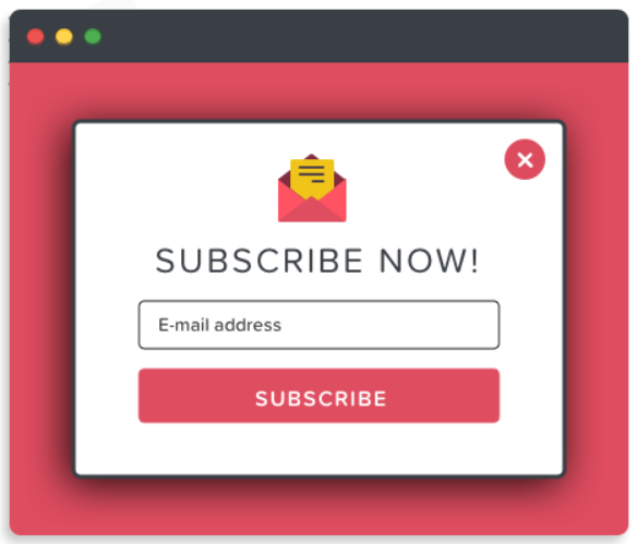
Wanted to showcase modal popups to promote offers, announcements, and alerts using Elementor on your WordPress websites? Great! You’ve landed on the right page.
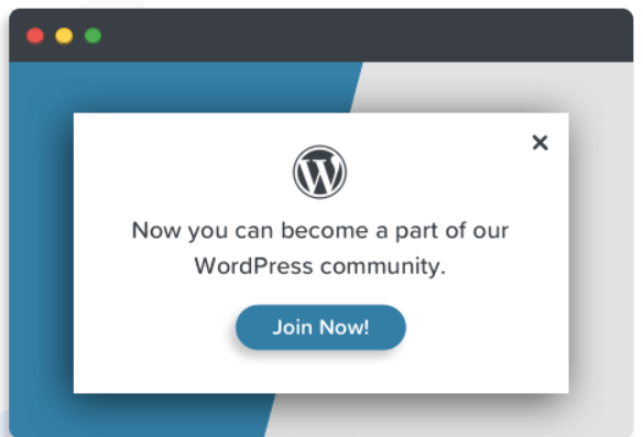
Modal popups are used on websites to bring users’ attention to a significant action or provide specific information.
In this article, we’ll provide detailed information about how you can add offers, announcements, or alerts through modal popups using the Elementor page builder.
So, without further ado, let’s move ahead.
Best Modal Popup Plugin for Elementor Page Builder
Choosing the right popup plugin for Elementor can feel overwhelming. With so many options available, it’s easy to end up with a tool that slows down your website, disrupts the user experience, or fails to deliver results.
That’s why it’s important to pick a solution that strikes the perfect balance – lightweight, user-friendly, visually appealing, and designed to boost conversions without compromising performance.
Meet the Popup Box Widget by PowerPack Addons for Elementor. This powerful yet easy-to-use widget gives you everything you need to create stunning popups that engage visitors and drive action, all while keeping your website fast and seamless.
Popup Box Widget by PowerPack Elementor Addons
PowerPack Addons for Elementor is one of the most trusted and feature-rich Elementor addons, offering 80+ powerful widgets. Among them, the Popup Box Widget helps you design stylish, responsive, and conversion-friendly WordPress popups directly inside the Elementor editor.
With this widget, you can design engaging popups that enhance user interaction without relying on extra plugins. Here’s what makes it so effective:
- Supports Multiple Content Types: Easily add images, videos, saved Elementor templates, custom HTML, or any custom content inside your modal popup.
- Advanced Popup Triggers: Control exactly when and how your popups appear with triggers like on-click, time delay, exit intent, or by targeting specific element IDs and classes.
- Attractive Animation Effects: Grab visitor attention with engaging popup animations such as zoom in/out, 3D unfold, newspaper, or slide-in transitions.
- Fully Customizable Design: Match your popups with your brand by customizing colors, borders, height, and layout for a seamless look and feel..
[How To] Add Popups to Your WordPress Sites Using Elementor & PowerPack
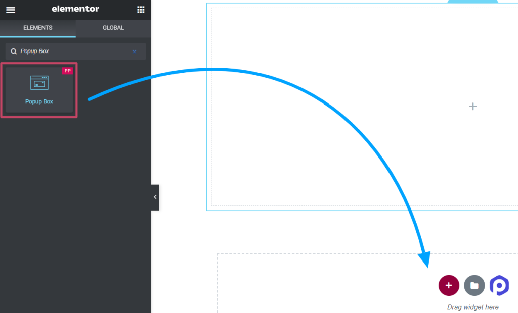
First, install and activate Elementor and PowerPack Addons on your WordPress website. Next, open your page in the editor, type “popup box” in the search bar, and drag & drop the widget.
Make sure to check for the PowerPack “PP” sign on the top-right corner of the widget.
Customize the Content Tab of the Popup Box Widget
Content tab of the popup box widget includes four sections:
- Content
- Layout
- Trigger
- Settings
Let’s look at each section one by one.
Content
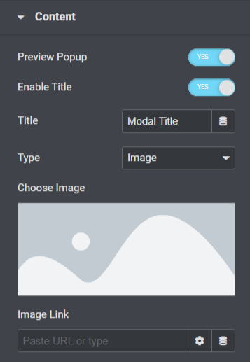
Let’s see what features are available in this section:
- Enable the “Preview Popup” option to see the live display of the popup box on your page.
- Toggle on the “Enable Title” option to show the popup title.
- Add a title for your popup in the “Title” option.
- You can choose a popup type using the “Type” option, such as image, link, content, saved templates, or custom HTML.
- If you’ve selected the “Image” option as the popup type, you can choose an image from the media library using the “Choose Image” option.
- Also, you can directly drop a link to display an image using the “Image Link” option.
- If you’ve chosen the ‘Link’ option as the popup type, you can directly drop a URL for any video, map, or page you want to display on the popup using the “Enter URL” option.
- You can customize the entire content with the “Content” option if you’ve chosen the ‘Content’ option as the popup type.
- If you’ve chosen the ‘Saved Templates’ option as the popup type, you can select templates for your popup box.
- If you’ve chosen the ‘Custom HTML’ option as the popup type, you can enter custom HTML.
Layout
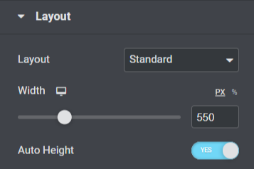
Let’s see what features are available in this section:
- Choose a layout for your popup, either standard or full screen, using the “Layout” option.
- You can adjust the width of the popup with the “Width” option.
- Also, you can enable the “Auto-Height” option for your popup box.
Trigger
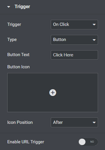
Let’s explore the features that are available in this section.
- Select the trigger action for the popup from the “Trigger” options, such as on click, time-delayed, exit intent, or element class ID.
- Customize the “Button Text” for your popup box.
- Choose a “Button Icon” for your popup box from the icon library.
- Choose “Icon Position” either ‘before’ or ‘after’ the button text.
- You can also enable “URL Trigger” for the popup box.
- You can enter an element ID in the “Element ID” option if you’ve enabled the URL trigger option.
Settings
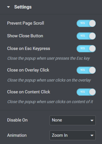
Let’s take a look at the available features in this section.
- This section includes multiple toggle options for settings such as “Prevent Page Scroll,” “Show a Close Button,” “Close an ESC Keypress,” “Close on Overlay Click,” or “Closing on Content Click.” Enable or disable these options as per your needs and preferences.
- Responsive features include an option as “Disable On.” In addition, you can choose mobile & tablet, mobile, or none according to your choice.
- “Animation” features to popup are available here; you can choose one among all these according to your preference.
That’s all for customization of the Content Tab of the Popup Box widget. Next, we’ll move to the next part, i.e., the Style Tab.
Style Tab of the Popup Box Widget
The style tab of the popup box widget includes five sections:
- Popup
- Overlay
- Title
- Trigger Button
- Close Button
Let’s look at each section one by one in brief.
Popup
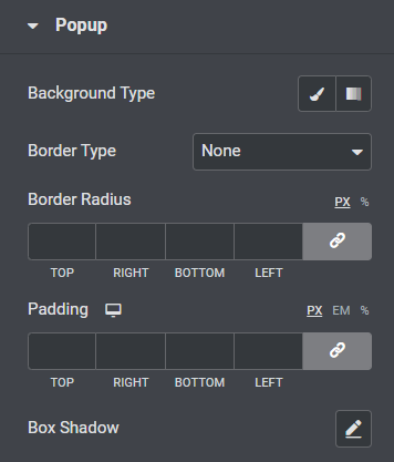
Let’s see what features are available in this section:
- You can customize the background of the popup box using the “Background Type” option.
- Choose a “Border Type” for the popup box from options such as solid, dotted, doubled, dashed, or groove.
- If you’ve applied a border, you can use a “Border Radius” to the popup box. It’ll allow the border to display curvy and smooth edges all around.
- Adjust the “Padding” for the popup box; it’ll maintain the spacing between the content and the border to let the popup look organized.
- Customize the “Box Shadow” option to display a shadow on the popup.
Overlay
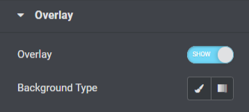
The overlay section includes a feature that enables an “Overlay” option to the popup box and lets you customize its “Background Type.”
Title
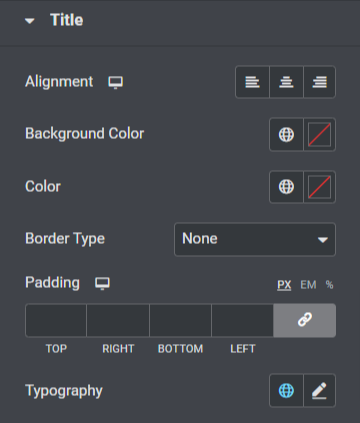
Let’s take a look at all the features available in this section.
- Set the alignment of the popup box title using the “Alignment” option.
- You can customize the “Background Color” for the popup box title.
- Also, you can choose the popup title text color using the “Color” option.
- Choose a “Border Type” for the popup box from given border type options such as solid, dotted, doubled, dashed, or groove.
- Adjust “Padding” for the popup box title.
- You can customize the popup box title text using the “Typography” option.
Trigger Button
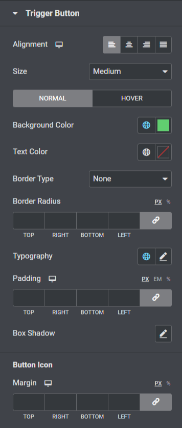
- You can set the “Alignment” of the trigger button for the popup.
- Choose an appropriate “Size” for the popup trigger button.
- Customize the “Background Color” and the “text color” for the trigger button.
- Choose “Border Type” for the trigger button and also adjust the “Border Radius” and “Padding.”
- Customize the trigger button text using the “Typography” option.
- Also, you can customize the shadow feature for the popup trigger button using the “Box Shadow” option.
- An additional option to adjust the “Margin” for the trigger button icon is also available in this section.
Close Button
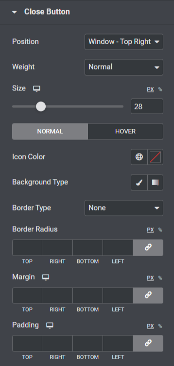
- Options to position the close button for the popup are available using the “Position” option. You can choose one according to your preference.
- You can choose the thickness from options such as ‘bold,’ ‘normal,’ or “Weight” options for the close button.
- Adjust the “Size” of the close button and choose an “Icon Color.”
- Apply a ‘gradient’ or ‘classic’ background for the close popup button using the “Background Type” option.
- Apply border to the close popup button using “Border Type” options, such as solid, dotted, doubled, dashed, or groove.
- If you’ve applied a border to the close button, you can adjust the “Border Radius” and its “Padding”; adjusting both features will allow the close popup button to look neat and organized.
- You can adjust the popup close button margin using the “Margin” option.
So, that is all; apply these changes to your Popup Box widget to see incredible changes.
Final Words!
Using the PowerPack Popup Box widget, you can add incredible modal popups in the Elementor page builder. We hope this tutorial blog helped you create fantastic “popups” for your website using the PowerPack Popup Box widget.
If you’ve enjoyed reading this article, you’d also love to experience our other PowerPack elements. Click here to get the PowerPack Popup Box widget for the Elementor page builder.
Please drop your comments here; we’d love your replies.
