Looking for an easy (and free) way to create charts in Elementor? You’ve landed on the right page!
If you’re using Elementor to build your WordPress website, you don’t need to rely on complicated coding to add charts. PowerPack Addons for Elementor includes an Advanced Charts widget that lets you create different types of interactive charts directly from the Elementor editor.
PowerPack’s Advanced Charts widget supports 7 different chart types: Line, Bar, Radar, Pie, Doughnut, Polar Area, and Bubble.
Among these, Line and Bar charts are available for free. This means you can create useful and interactive charts on your Elementor website without purchasing a Pro plan.
In this guide, we’ll see how to create both Line and Bar charts in Elementor for free, along with an explanation of the different settings available for customizing them.
Create Charts in Elementor for Free
Before we get started, let’s first see why you should add charts to your Elementor Website.
Why Add Charts to Your Elementor Website?
Charts can make data-heavy content much easier to understand. For example, if you want to show monthly sales, website traffic, survey results, product performance, or year-over-year growth, a chart can communicate the information much faster than a paragraph or spreadsheet.
They can also make pages more engaging. Instead of presenting visitors with static numbers, you can use interactive features such as tooltips and animations to give them a better way to explore your data.
With PowerPack’s Advanced Charts widget, you can create these charts directly inside Elementor and customize their appearance and behavior without writing JavaScript or manually creating a chart using code.
Now, without any further ado, let’s start our tutorial!
Install and Activate PowerPack Addons Lite or Paid Version
First, install PowerPack Addons for Elementor on your WordPress website. You can use either the free Lite version or the paid version, depending on the features you need.
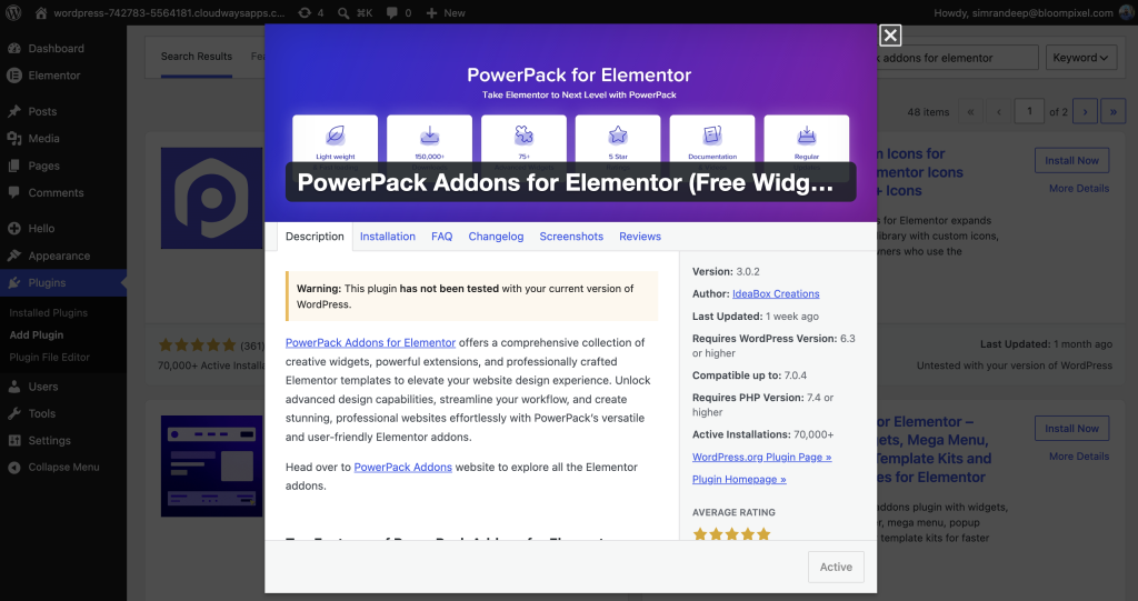
If you’re using the Lite version, go to Plugins >> Add New Plugin from your WordPress Dashboard and search for PowerPack Addons for Elementor. Install and activate the plugin.
If you already have the paid version, upload the PowerPack plugin ZIP file, then install and activate it. Make sure Elementor is also installed and activated, as PowerPack Addons is built specifically for Elementor.
Create a Line Chart in Elementor for Free
Once PowerPack is active, you’re ready to add the Advanced Charts widget to your page. Since Line and Bar charts are available for free, you can use either PowerPack Addons Lite or the paid version.
Add the PowerPack Advanced Charts Widget
Open your WordPress Dashboard and create a new page, or edit an existing page with Elementor.
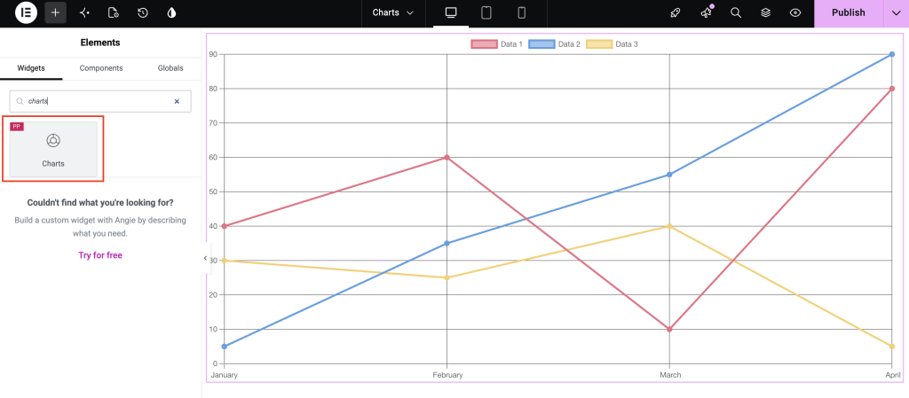
Search for “Charts” in the Elementor widget panel. As the charts widget appears, drag & drop it onto your Elementor canvas.
Once you add the widget, you’ll see chart settings in the Elementor panel. From here, you can choose your chart type, add your data, and customize how your chart looks and behaves.
Choose the Line Chart Type
Under the Advanced Charts settings, you’ll find the Chart Type option. Select Line from the dropdown.
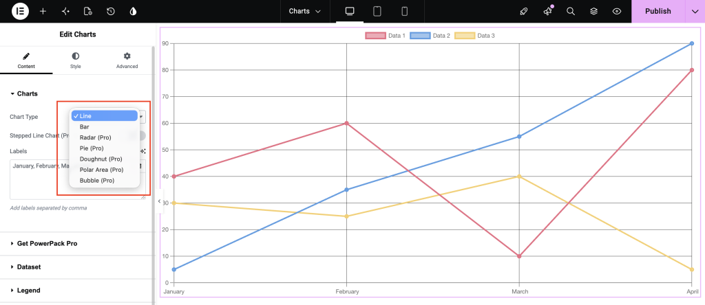
Your chart will now use a line-based layout. This is particularly useful when you want visitors to see a trend or movement between different data points.
Add Labels to Your Chart
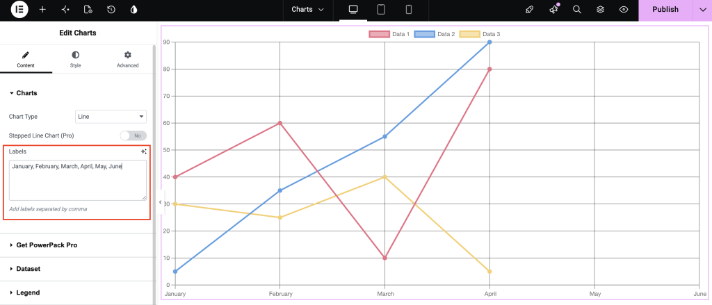
Next, you need to define Labels for your chart.
Labels tell visitors what each data point represents. Depending on your data, labels could be months (January, February, March) or categories (Product A, Product B, Product C).
For example, if you’re creating a chart to show monthly sales, you could use: January >> February >> March >> April >> May >> June
These labels will appear along the relevant axis and help visitors understand what each value represents.
Add Data Using Dataset
Once you’ve added your labels, you need to enter the corresponding values. You can do this from the Dataset section.
You get 3 source options to define a dataset in your chart:
- Custom
- CSV
- Google Sheets
Custom & CSV come with the free version, while to display Google Sheets data in chart format, you need the pro version of PowerPack Addons for Elementor.
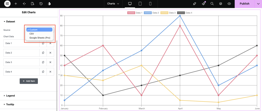
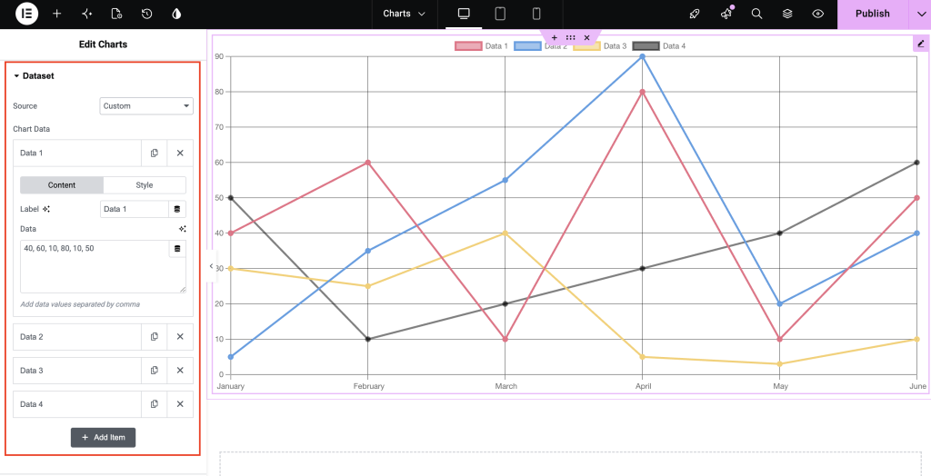
A dataset is basically a collection of values that you want to display on your chart. For example, if your labels represent six months, you can add six corresponding sales values.
You can also add multiple datasets to compare different sets of information. For example, an online store could create separate datasets for 2025 Sales and 2026 Sales. Visitors can then compare the two sets of values in the same chart.
Each dataset can also be customized individually using the available styling options. This makes it easier to distinguish among different datasets when multiple datasets are used.
Customize the Chart Legend
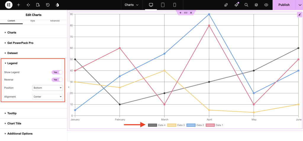
Legend is the element that helps visitors understand what each dataset represents. This becomes especially useful when your chart contains multiple datasets.
Enable Show Legend if you want to display the dataset names alongside the chart.
You can also enable Reverse to change the order in which legend items are displayed. This can be useful when you want the legend order to match a particular visual or content structure.
PowerPack also lets you control the Legend Position. You can place it on the Left, Top, Bottom, or Right side of your chart. Choose a position that works well with your page layout and doesn’t make the chart feel crowded.
The Alignment setting gives you further control over how legend items are positioned. You can align them to the Start, Center, or End.
Add Interactive Tooltips
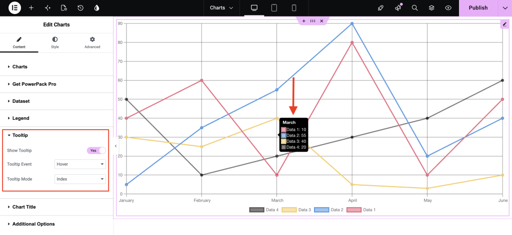
Tooltips make your charts more interactive. When visitors interact with a data point, a tooltip can display additional information about that value.
Enable Show Tooltip to add this functionality to your chart.
You can then choose how visitors trigger the tooltip using Tooltip Event. With Hover, information appears when a visitor moves their cursor over a data point. With Click, visitors need to click a data point to see its information.
You can also choose how much information the tooltip displays using Tooltip Mode.
Index displays information for all datasets associated with the selected position. This is useful when you’re comparing multiple datasets, as visitors can see the corresponding values side by side.
Point focuses on the individual data point being interacted with. This keeps the tooltip focused on one particular value.
Dataset displays information related to the selected dataset, making it useful when you want visitors to focus on one complete set of data.
Add Chart Title
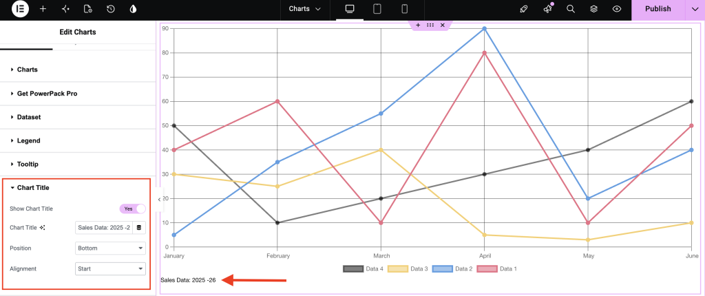
You can also display a Chart Title to help users quickly understand what the chart represents.
To add a title, enable the Show Chart Title option, enter your desired Chart Title, and then set its position and alignment according to your preference.
Customize Additional Line Chart Options
PowerPack provides several additional settings that let you control how your line chart is displayed.
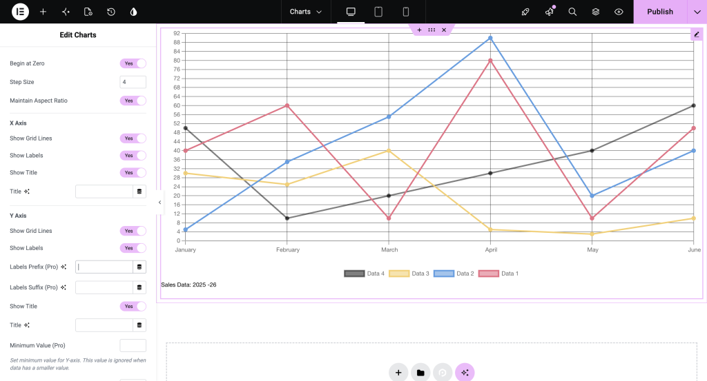
Begin at Zero
Begin at Zero controls where the Y-axis starts. When enabled, the Y-axis starts from zero. This is useful for charts where you want the visual difference between values to accurately reflect their difference in size.
For example, if you’re creating a sales chart, starting the axis at zero can make comparisons easier and prevent small differences from appearing visually exaggerated.
Show Grid Lines
Enable Show Grid Lines if you want horizontal or vertical reference lines to appear behind your chart. Grid lines can make it easier for visitors to estimate the value of each data point.
They are particularly helpful when your chart contains many values and readers need some visual reference while comparing them.
Show Labels
The Show Labels option controls whether labels are displayed on the chart. Enable it when you want visitors to see the values or relevant labels directly rather than relying only on the axes and tooltips.
Whether you should enable this depends on how much information your chart contains. For a simple chart, showing labels can improve readability. For a chart with many data points, hiding them can create a cleaner layout.
Step Size
The Step Size setting controls the interval between Y-axis values. For example, you could set the step size to 10 so that the axis displays values at intervals of 10, 20, 30, and 40.
Choosing an appropriate step size can make your chart much easier to read, especially when working with a large range of values.
Maintain Aspect Ratio
Enable Maintain Aspect Ratio to preserve the chart’s proportions as its size changes. This can help keep your chart from becoming unnecessarily stretched or compressed when viewed across different screen sizes.
Line Tension
Controls how smoothly the line moves between data points. A higher tension can give the line a more curved appearance, while reducing the tension makes the line more direct between points.
You can adjust this setting depending on whether you want a smooth, modern-looking chart or a more straightforward presentation.
Add Animation to Your Line Chart
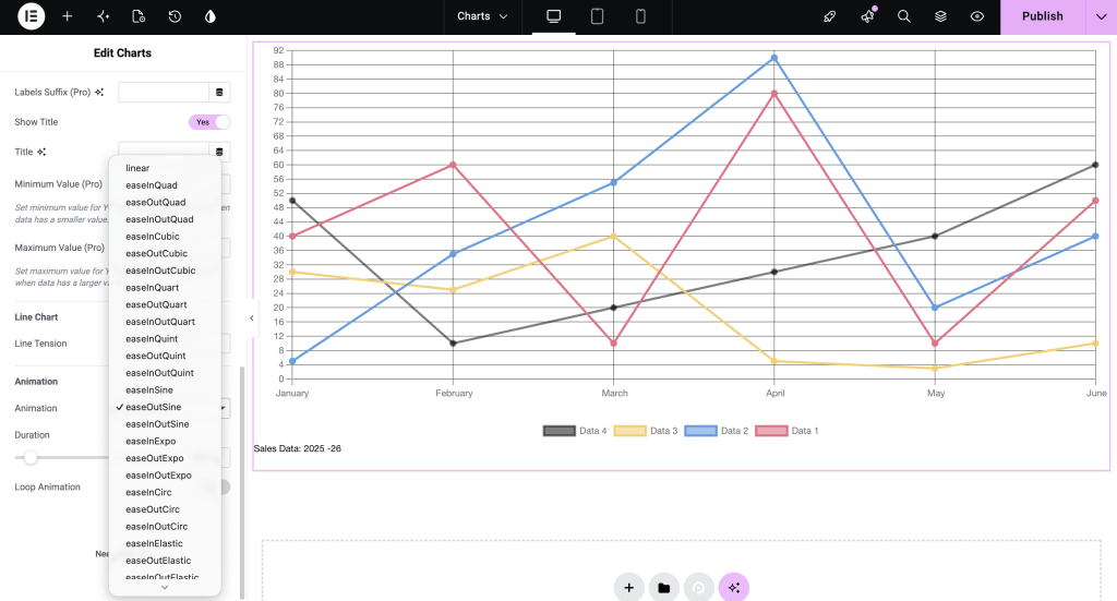
Animations can make a chart feel more dynamic when it loads on the page.
PowerPack provides different Animation Options, including Linear, easeInQuad, easeOutQuad, and easeInOutQuad. These control how the chart animation progresses.
You can also control Duration, which determines how long the animation takes to complete. A shorter duration creates a quick transition, while a longer duration makes the animation more noticeable.
If you want the chart animation to repeat, enable Loop Animation. This will continuously replay the animation instead of allowing it to run only when the chart initially loads.
For most websites, a subtle animation is usually enough. Too much movement can distract visitors from the actual information you’re trying to present.
Create a Bar Graph in Elementor for Free
A bar chart is another useful way to visualize data in Elementor. Unlike line charts, which are often used to show trends, bar charts work particularly well when you want to compare separate categories.
For example, you could use a bar chart to compare sales across products, traffic across pages, or performance across departments.
With PowerPack Advanced Charts, you can create both vertical and horizontal bar charts.
Add the Advanced Charts Widget
Open your WordPress Dashboard and create a new page or edit an existing page using Elementor. Search for the PowerPack Advanced Charts widget and drag it onto your Elementor canvas.
Once the widget is added, you can start configuring your bar graph from the Elementor settings panel.
Select Bar as the Chart Type
Under Chart Type, select Bar.
After selecting Bar, you’ll get an additional Orientation option. This lets you decide how your bars should be displayed.
Vertical Bar Chart
A Vertical Bar chart displays bars from the bottom toward the top.
This is a common choice for comparing categories or showing changes across a series of labels. For example, you could use a vertical bar chart to compare sales for different products.
Horizontal Bar Chart
A Horizontal Bar chart displays bars from left to right.
This layout can be useful when category names are long. Instead of trying to fit long labels underneath several vertical bars, a horizontal layout gives them more room.
You can choose between vertical and horizontal orientation based on your data and page layout.
Add Labels
After selecting the orientation, add your Labels.
Labels represent the categories you want to compare. For example, if you’re creating a chart showing product sales, your labels could be: Product A, Product B, Product C, Product D
You can then enter the corresponding sales figures in the Dataset section.
Using meaningful labels is important because visitors should be able to understand what each bar represents without having to guess.
Add Your Data Using Dataset
The Dataset section is where you enter the actual values for your bar chart.
You can add multiple values and create multiple datasets when you need to compare different groups.
For example, an online store could create one dataset for Online Sales and another for Offline Sales. This allows visitors to compare the two numbers on the same chart.
Each dataset can also be styled individually, making it easier to visually separate different types of information.
Customize the Bar Chart Legend
If your bar chart contains multiple datasets, a legend can help visitors understand what each dataset represents.
Enable Show Legend to display it.
The Reverse option changes the order of legend items, while Legend Position lets you place the legend on the Left, Top, Bottom, or Right.
You can also use Legend Alignment to position the legend items at the Start, Center, or End.
If your chart only contains one dataset, you may not need a legend at all. In that case, hiding it can give your chart a cleaner appearance.
Add Tooltips to Your Bar Chart
Tooltips are also available for bar charts.
Enable Show Tooltip to allow visitors to interact with individual bars and view additional information.
Under Tooltip Event, you can choose between Hover and Click. Hover is useful when you want information to appear immediately as visitors move across the chart. Click can be a better option when you want visitors to intentionally select a particular bar.
You can then select a Tooltip Mode.
- Index shows information for all datasets at the selected category. This works well for comparison charts because visitors can see values from multiple datasets at once.
- Point displays information for the specific data point being selected.
- Dataset focuses on the selected dataset and is useful when you want to highlight information belonging to a particular data series.
Customize Additional Bar Chart Options
PowerPack also gives you several options to control how your bar graph behaves and appears.
Show Grid Lines
Adds reference lines to the chart, making it easier to estimate the value represented by each bar.
Show Labels
Displays relevant labels directly on the chart. This can be helpful when you want visitors to understand values without interacting with the chart.
Begin at Zero
Makes the Y-axis start at zero. This is particularly useful for bar charts because starting from zero gives a more accurate visual comparison between bar sizes.
Step Size
You can define the interval used on the value axis. For example, you could use increments of 10, 100, or 1,000 depending on your data.
Maintain Aspect Ratio
Helps preserve the proportions of your chart when its dimensions change. This can be useful for maintaining a consistent appearance across different screen sizes.
Stack Multiple Datasets
The Stacked option is useful when you have multiple datasets and want to display them as parts of a combined bar.
For example, imagine you want to show the total number of website visitors and the share from organic search, social media, and direct traffic. A stacked bar chart can display these values together, allowing visitors to understand both the individual categories and their combined total.
This is different from a regular bar chart, where multiple datasets are generally displayed side by side for comparison.
Add Animation to Your Bar Graph
Just like line charts, bar charts can also be animated.
Use Animation Options to choose how the chart should appear when it loads. You can select from different animation styles, including Linear, easeInQuad, easeOutQuad, and easeInOutQuad.
The Duration setting controls how long the animation takes. You can increase or decrease it depending on how noticeable you want the animation to be.
If you enable Loop Animation, the animation will repeat rather than run only once.
For most websites, it’s a good idea to keep animations relatively subtle. A chart should help visitors understand information, not compete with other elements on your page.
Line Chart vs. Bar Chart: Which One Should You Use?
Both chart types can be useful, but they work best for different kinds of information.
A line chart is a good choice when you want to show a trend, progression, or change across a sequence of values. If you’re displaying monthly sales, yearly revenue, website traffic over time, or any similar trend, a line chart can make changes easier to spot.
A bar chart is generally better when your main goal is to compare separate categories. If you want to compare different products, services, departments, locations, or other groups, bars make those differences easy to see.
Think about what you want visitors to understand from your data. If you want them to see how something changes, start with a line chart. If you want them to see how different categories compare, a bar chart will usually be a better fit.
Create Elementor Charts Without Coding
Adding charts to a WordPress website doesn’t have to involve custom JavaScript, complicated libraries, or manually creating chart layouts.
With the PowerPack Advanced Charts widget, you can create interactive charts directly inside Elementor. The widget supports seven chart types, including Line, Bar, Radar, Pie, Doughnut, Polar Area, and Bubble charts, while Line and Bar charts are available for free.
You can also customize important parts of your chart, including labels, datasets, legends, tooltips, grid lines, axis settings, aspect ratio, animations, and more.
So, if you’re looking for a simple way to create charts in Elementor for free, PowerPack Advanced Charts gives you an easy starting point without requiring coding knowledge.
