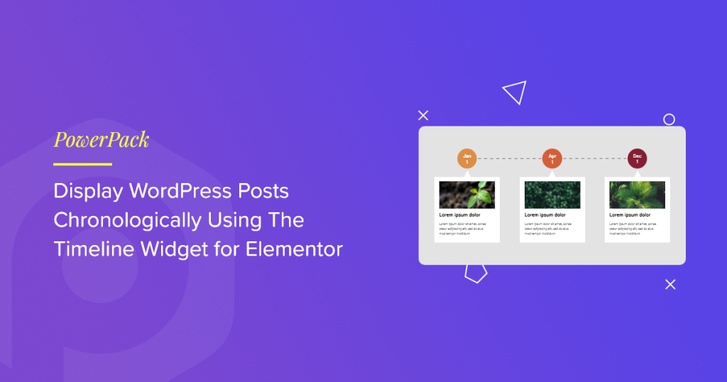
Wanted to display your WordPress posts in chronological order using the Elementor Timeline widget? If yes, then you’ve landed on the right page.
Timeline widgets enable you to showcase your site content in timelines, accurately displaying the date and time.
Let’s say you’re a freelancer and want to display your best posts chronologically on your website. If you want to showcase your most popular posts to your audience, you can use the Timeline widget.
In this article, we’ll provide detailed information about how to display WordPress posts in a timeline format using Elementor and PowerPack Elementor Addons.
Why Use Timelines to Display WordPress Posts?
Timelines display content in a sequential, clickable format perfect for highlighting historical events, achievements, or key milestones. Each item is organized by date, making it easy for users to follow the progression of your content.
Adding timelines to your website offers several benefits:
- Showcase posts by date – Display both old and new blog posts along with their respective dates to provide visitors with context and continuity.
- Highlight milestones – Use timelines to present business achievements, company history, or project timelines.
- Improve engagement – Drive traffic to older posts by reintroducing them in an engaging, structured format.
- Enhance storytelling – Share your journey step by step, building a narrative that resonates with your audience.
- Boost user experience – Well-organized timelines make content easier to digest and navigate.
- Build credibility – Presenting a clear timeline of your growth or experience can help establish trust with your visitors.
In short, displaying WordPress posts in a timeline format is a smart way to add structure, clarity, and impact to your website content.
Best Timeline Widget for Elementor
Timelines are a great way to showcase your WordPress posts in chronological order using the Elementor plugin. However, the free and pro versions of Elementor do not offer a built-in timeline widget.
To add this functionality, you’ll need a third-party addon. One of the best options available is PowerPack Addons for Elementor.
PowerPack offers 80+ powerful widgets and 150+ professionally designed templates that make it easy to build visually engaging timelines and enhance your website’s overall design—without writing a single line of code.
PowerPack Timeline Widget for Elementor
The PowerPack Timeline widget is designed to be both flexible and feature-rich, allowing you to create fully customized timelines with ease. Here’s a quick overview of its key features:
Features of PowerPack Timeline Widget
- Supports Custom and Dynamic Content: Easily display dynamic content, such as blog posts, or create custom entries tailored to your specific needs.
- Extensive Styling & Customization Options: Customize card arrows, animations, spacing, and more to match your site’s design.
- Advanced Typography Controls: Fine-tune typography settings, fonts, sizes, line heights, and more, for every part of your timeline content.
- Directional Control for Timeline Bars: Choose how the timeline progresses: left, right, or alternating, for a unique visual flow.
- Vertical & Horizontal Layouts: Build timelines in both vertical and horizontal formats to suit your layout preferences and content type.
Let’s explore each of these functionalities in more detail.
Display Your WordPress Posts in Timeline Format Using Elementor
To display WordPress post timelines on your website, ensure that you have installed and activated the Elementor page builder and PowerPack Elementor Addons.
Now, open the page using the Elementor editor, type timeline in the search bar, and drag & drop the widget on the page.
Don’t forget to check for the PowerPack PP sign in the top-right corner of the widget.
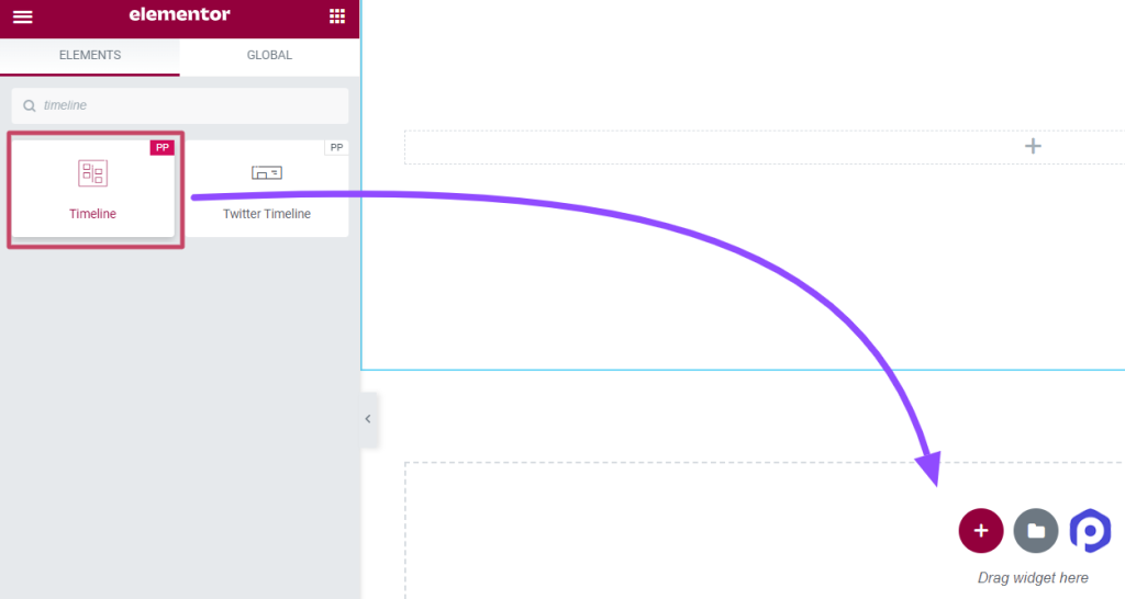
Once you drag and drop the widget on the page, navigate to the Content Tab.
Customize and Configure The Content Tab of the Timeline Widget
The Content Tab of the timeline widget includes four sections:
- Settings
- Query (This section will display only if you choose the timeline source as “Posts”)
- Posts (This section will show only if you select the timeline source as “Posts”)
- Timeline
Let’s see each of these sections in detail.
Settings
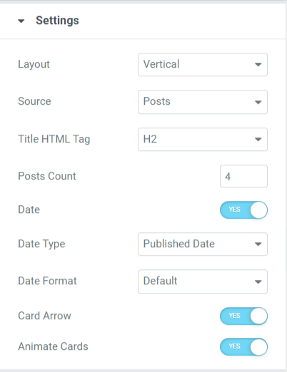
Let’s look at the available features in this section:
- Layout: Choose your timeline layout, either vertical or horizontal.
- Source: Since we’re discussing how to display WordPress posts chronologically, you need to select the source type as Posts. Selecting the Posts option will allow the Timeline widget to fetch your existing website content (including any existing posts, templates, saved sections, etc.) and list them in a timeline format.
- Title HTML Tag: With the help of this feature, you can set an HTML tag for the content title for each post.
- Post Count: Using this option, you can set the number of posts you want to display in the timeline.
- Date: Enable this feature to display the published dates of posts.
- Date Type: Choose a date type using this option.
- Date Format: With this option, you can choose the date format.
- Card Arrow: Enable this option to display a card-like pattern for each content post.
- Animate Cards: Apply this feature to enable the card animation for the timeline.
Query
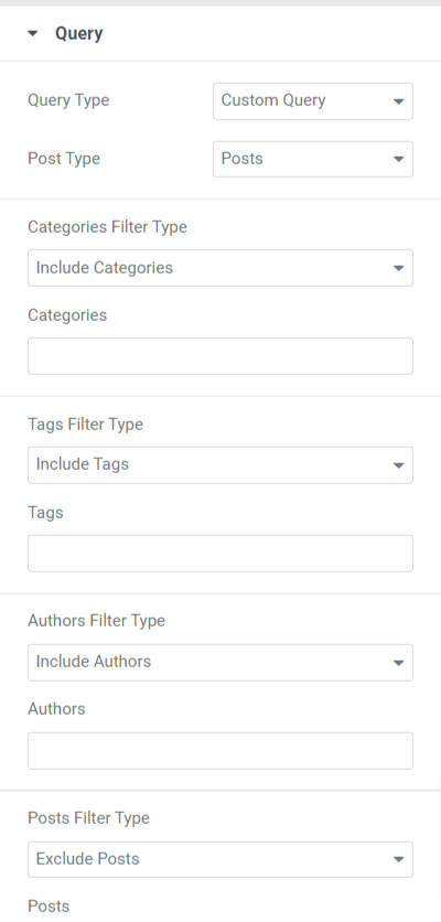
Let’s look at the available features in this section:
- Query Type: You must choose a query type and a custom query as the query type using this option.
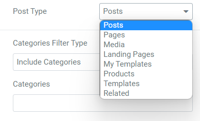
- Post Type: Several options for choosing post types are available, including pages, posts, and saved templates. Select a post type from the following options.
- Include/Exclude category options for various filter types, such as categories, tags, authors, and posts.
Posts
Let’s look at the available features in this section:
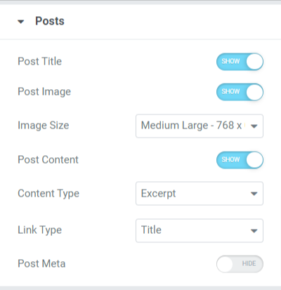
- Post Title: Toggle this option on to display a post title on your timeline posts.
- Post Image: Enable the post image option to display an image alongside the content in the timeline.
- Image Size: This option allows you to select the image size for the timeline posts.
- Post Content: Enable this option to display post content in the timeline.
- Content Type: Using this feature, we can choose the excerpts or limited content options for our posts.
- Link Type: Select a link type where you want to place the link, such as the title, button, or card.
- Post Meta: Enable this option to display additional post categories, such as post author, post terms, etc.
- Meta Items Divider: If you’ve enabled the post meta option, you can allow a meta items divider to display a divider between the post items displayed on the timeline posts.
- Post Author: Enable this option if you want to display the post author on the timeline post.
- Post Terms: Enable this option to display post terms on the timeline post.
- Select Taxonomy: You can add categories and tags of your choice using this option.
However, you can also customize the timeline post using a custom source. By choosing this option, you can manually customize the timeline posts, add their content, media, and many more.
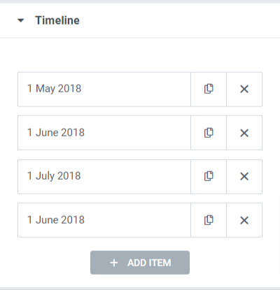
Timeline
So this was all about customizing the Content Tab of the PowerPack Timeline widget. Now let’s move to the next part, i.e., the Style Tab.
Customize and Configure The Style Tab of the Timeline Widget
The content tab of the advanced tabs widget includes five sections:
- Layout
- Cards
- Marker
- Dates
- Connector
Let’s see each of these sections in detail.
Layout
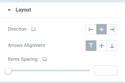
Let’s look at the available features in this section:
- Direction: Set the timeline bar direction using this option.
- Arrow Alignment: Select an arrow alignment with this option.
- Items Spacing: Adjusting this option will allow spacing between the posts included on the timeline.
Cards
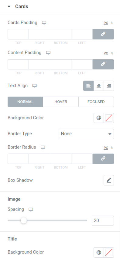
Let’s look at the available features in this section:
- Cards Padding: This option allows cards to create spacing between them.
- Content Padding: This option will create spacing between the content and the cards.
- Text Align: Use this option to set the text alignment.
- Background Color: Text background color can be changed using this option.
- Border Type: This option allows you to display a border around the card. Select borders from the available types, including solid, dotted, double, dashed, and grooved.
- Border Radius: Apply border radius to display fine edges to the borders.
- Box Shadow: This feature allows you to display a shadow border. Customize color and weight accordingly.
Marker
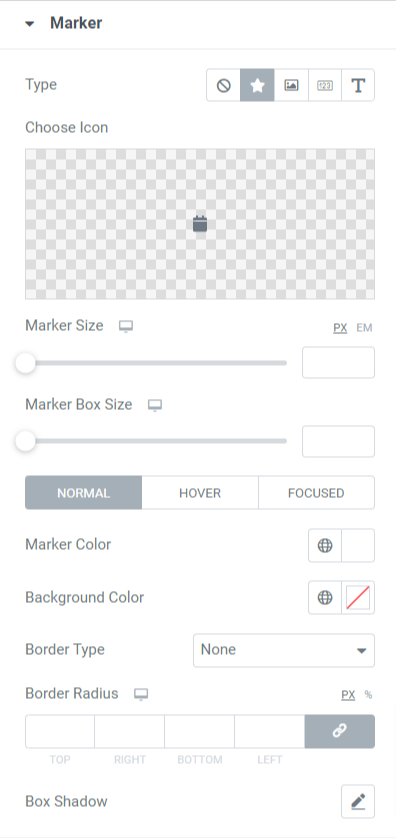
Let’s look at the available features in this section:
- Type: Choose Marker type as icon, image, number, or text.
- Choose Icon: If you’ve selected an icon as marker type, then choose an icon and upload one from the icon library.
- Choose Image: If you’ve selected an image as marker type, then choose an image and upload one from the media library.
- Marker Size: Set marker size using this option.
- Marker Box Size: Use this option to set the marker size.
- Marker Color: Select a marker color using this option.
- Background Color: Customize marker background color with this option.
- Border Type: Choose a border for the marker from options such as solid, dotted, doubled, dashed, and groove.
- Border Radius: Apply a radius to provide smooth edges to the radius that you’ve applied.
- Box Shadow: Configure the box shadow option to enhance the marker’s appearance by displaying a shadow.
Dates
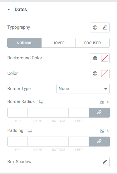
Let’s look at the available features in this section:
- Typography: Customize the entire date text typography using this option.
- Background Color: Customize the date text background color with this option.
- Color: Choose a date text color using this option.
- Border Type: Select a border for the date text from the given options, including solid, dotted, double, dashed, and groove.
- Border Radius: Applya radius to provide smooth and clean edges to the radius that you’ve applied.
- Padding: This option creates sufficient spacing between the date text and its border.
- Box Shadow: Configure the box shadow option to enhance the date text appearance by displaying a shadow.
Connector
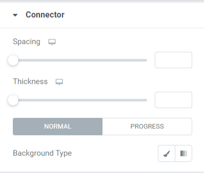
Let’s look at the available features in this section:
- Spacing: This option will allow spacing between the connector and the content cards.
- Thickness: This option allows you to adjust the thickness of the connector.
- Background Type: Customize the connector background type with this option.
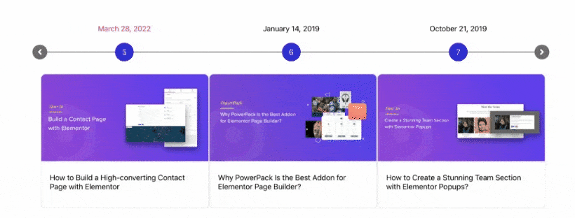
So this was all about creating a stunning timeline for your WordPress website. Once you apply all these changes to the Content & Style tab of the PowerPack Timeline widget, you’ll get something like this.
Get the Best Timeline Widget for Elementor
We hope this tutorial blog has helped you create incredible timelines for your website using the PowerPack Timeline widget.
Click here to get the PowerPack timeline widget, attract new customers to your website, and increase sales.
If you’ve enjoyed reading this article, you’d also love to experience our other PowerPack elements.
Please feel free to drop your comments here; we’d love to receive your replies.
