Advanced Charts for Elementor
Transform your data into dynamic, animated, interactive charts that capture your audience’s attention. The Advanced Charts Widget for Elementor makes presenting your data in stunning ways easy.
7 Chart Types to Make Your Data Stand Out
Each of the seven chart types offers unique ways to visualize your data. Choose the one that best fits your needs, and watch your data come to life!
Line Chart
Vertical & Horizontal Bar Chart
Horizontal Bar Chart
Vertical Bar Chart
Radar Chart
Polar Area Chart
Doughnut & Pie Chart
Doughnut Chart
Pie Chart
Bubble Chart
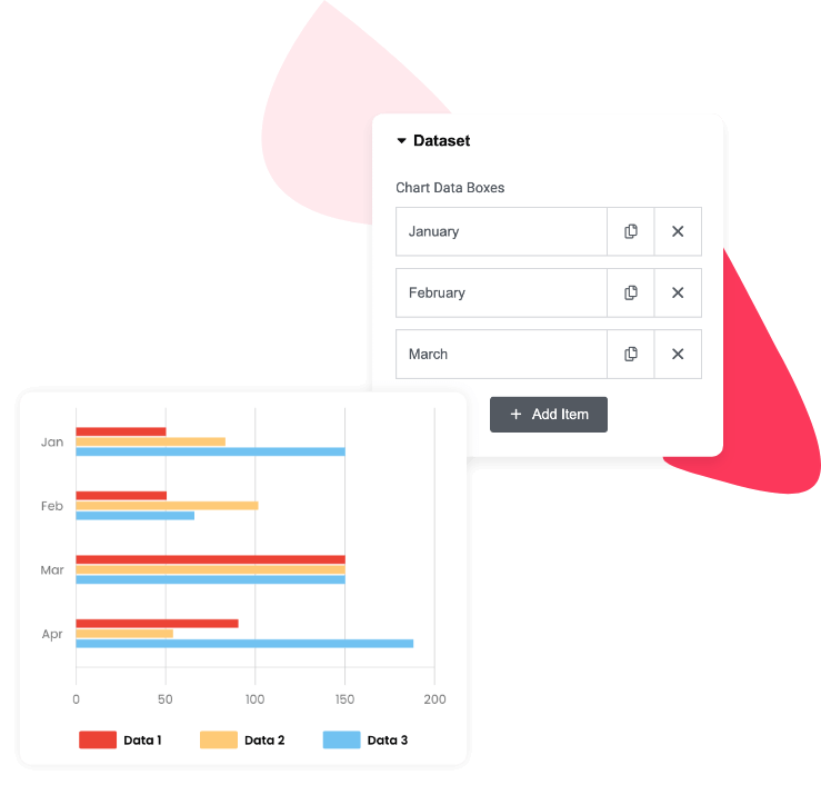
Unlimited Datasets for Complete Flexibility
Need to compare more data points? No problem! The Advanced Charts widget lets you add as many datasets as you want on your Elementor websites, making it easy to display multiple variables. Show side-by-side comparisons, track progress over time, or easily display complex datasets.
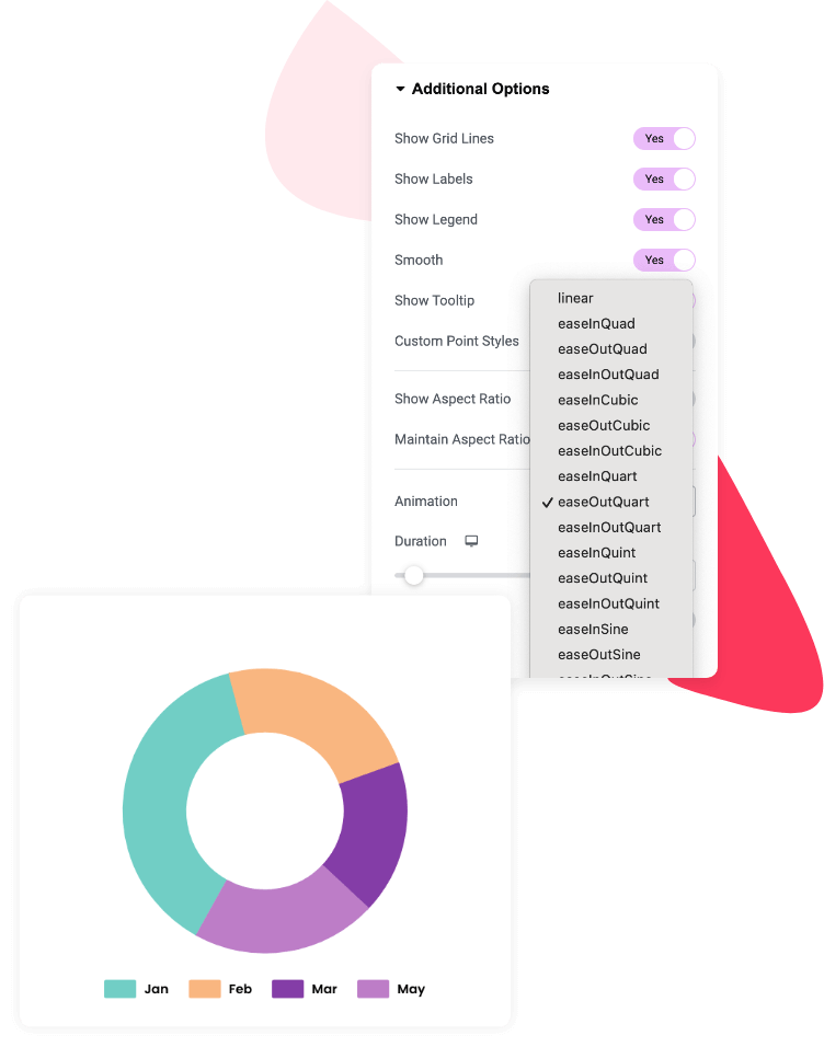
Animations That Make Your Charts Pop
Captivate your audience with smooth, eye-catching animations. The Advanced
Charts widget offers 20+ animation options—from linear and ease-in-out effects to dynamic bounce animations like easeInBounce and easeOutBounce. Choose the animation style that best suits your website’s design.
Line Chart
Use the Line Chart to showcase things like sales over the last few months or changes in traffic to your website.
Radar Chart
The Radar Chart lets you display multiple dimensions of data at once. It’s perfect for showing skill assessments, performance across different areas, or customer satisfaction ratings.
Doughnut & Pie Chart
Show the breakdown of data visually appealingly with Doughnut and Pie charts. They’re perfect for illustrating market share, budget allocations, or survey responses in an easy-to-understand format.
Doughnut Chart
Pie Chart
Polar Area Chart
For showcasing proportional data in a circular format, the Polar Area Chart is a great choice. Use it to represent distribution patterns, survey data, or demographic breakdowns.
Bubble Chart
Show relationships between three data points with the Bubble Chart. Use it to compare product performance, sales, or customer feedback, with each bubble representing different data sets.