
 [Extended] BFCM Sale! Get up to
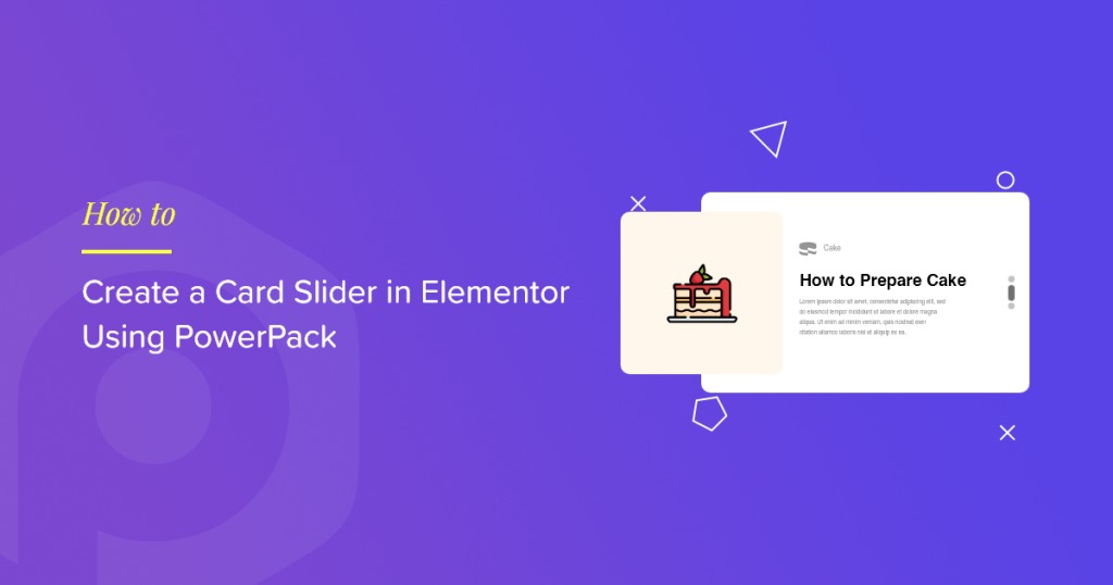
If you’re looking for ways to showcase content in images or videos, consider using a Card Slider.
A Card Slider is a dynamic design element that displays a slideshow of images/videos and the content in an attractive card format. It displays one card at a time, and subsequently, changes to another slide either automatically if transitions are applied or through a mouse click.
If you want to create an appealing Card Slider using Elementor on your website built with WordPress, you need to use a Card Slider widget.
In this article, we’ll provide you with a detailed step-by-step tutorial on creating a Card Slider in Elementor using PowerPack.
PowerPack Card Slider Widget for Elementor
PowerPack Elementor Addons is one of the best addon for Elementor. It’s a professionally designed package of 80+ premium widgets, including the PowerPack Card Slider widget.
PowerPack Card Slider widget offers a wide selection of high-quality features to create a fully responsive card slider section. It includes an auto-play animation feature, multiple styling features, and many more.
But wait! Don’t worry, you don’t need to touch even a single line of code while using it.
If you prefer watching a video, you can consider this tutorial video on how to create a Card Slider in Elementor.
Add a Card Slider Section to Your WordPress Website
To add a Card Slider to your WordPress website, you need to install Elementor and PowerPack Addons for Elementor.
Once you have installed both of these tools, you can use them both to create an impressive Card Slider section on your WordPress website.
So, without further ado, let’s move ahead to the tutorial to create a card slider using Elementor.
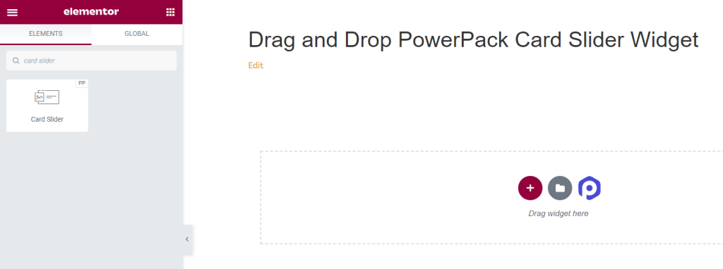
Drag and Drop PowerPack Card Slider Widget
First, open the page in the Elementor editor, then type “card slider” in the search bar and drag and drop the widget on the page.
Make sure to check for the PowerPack “PP” sign on the top right corner of the widget.
Content Tab of PowerPack Card Slider Widget
Navigate to the Content Tab of the PowerPack Card Slider widget. There you’ll find four sections:
- Card
- Query (only if you choose “Post” source in the Card section)
- Posts (only if you choose “Post” source in the Card section)
- Additional Options
Let’s discuss the functionalities of all these sections in detail.
Card
The Card section in the Content tab of the Card Slider widget allows you to add content to the widget.
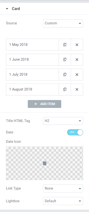
The Card section offers six subsections to add the content to the widget.
Let’s discuss them in detail:
- Source: Here, you can select the card source, either custom or posts. Then, add the contents to your card, such as the date, title, description, link, etc. by clicking to “Add items.”
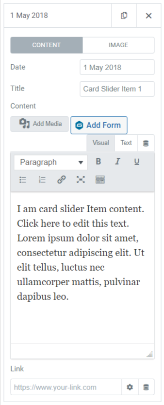
- Title HTML Tag: Select the HTML Tag for the title you’ve given in the card.
- Date: Toggle on this feature if you want to display the date.
- Date Icon: Select the date icon from the icon library or upload it from the media library by clicking “upload SVG.”
- Link Type: Here, you can select an option in which you want to drop a direct link such as title, image, button, or box. Also, you can choose ‘none’ if you don’t want to put any link to the card.
- Lightbox: Select the lightbox options from default, yes or no.
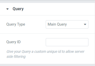
Query
If you choose Main Query as the Query Type, then you get the options to add:
- Query ID: Here, you can add a particular Query ID.
If you choose Custom Query as the Query Type, You’ll get numerous options to customize the query manually.
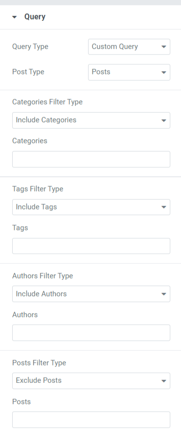
Let’s see the options included in the Query section:
- Posts Type: Select the post type you want to display on the card.
- Include / Exclude: Using this option, you can include or exclude the categories, tags, authors, and posts filter types.
- Date: You can choose the date format here.
- Order: Select among ascending or descending to order the post animation.
- Order By: Order the post according to the options given: date, last modified date, random, comment count, title, post ID, post author, menu order, or relevance.
- Sticky Posts: Toggle on this feature to show sticky posts in the card slider.
- Offset: Adjusting the offset position will help display the posts in the provided offset position.
- Exclude Current Post: Enable this option to remove the current posts.
Note: This option is only available when you select “Post” source in the Card Section of the Content Tab.
Posts
In this section, you’ll get numerous options to customize the posts displayed on the card.
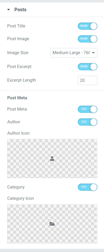
Let’s have a look at the subsections this section includes:
- Post Title: Toggle on this feature if you want to show a post title in the Card Slider.
- Post Image: Enable this option if you want to display an image along with the post.
- Image Size: Choose an image size from the wide range of size options given in this subsection.
- Post Excerpt: Enable this feature if you want to display an excerpt to your post.
- Excerpt Length: You can adjust its length if you’ve enabled the post excerpt feature here.
- Post Meta: Enabling this feature will give you options to customize more options like the author, author icon, category, and category icon.
- Author: Toggle on this feature if you want to display the author’s name on the post.
- Author Icon: Select the author icon from the icon library or directly upload an image from the media library.
- Category: Enable this feature to display the post category in the card slider.
- Category Icon: Select the category icon from the icon library or directly upload an image from the media library.
Note: This option is only available when you select “Post” source in the Card Section of the Content Tab.
Additional Options
This section will get various additional options to customize the card slider.
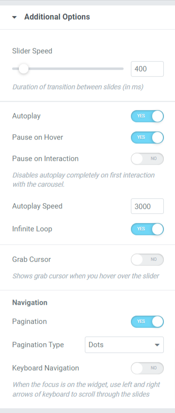
Let’s see all the options available in the additional options section:
- Slider Speed: Adjust the slider animation speed here.
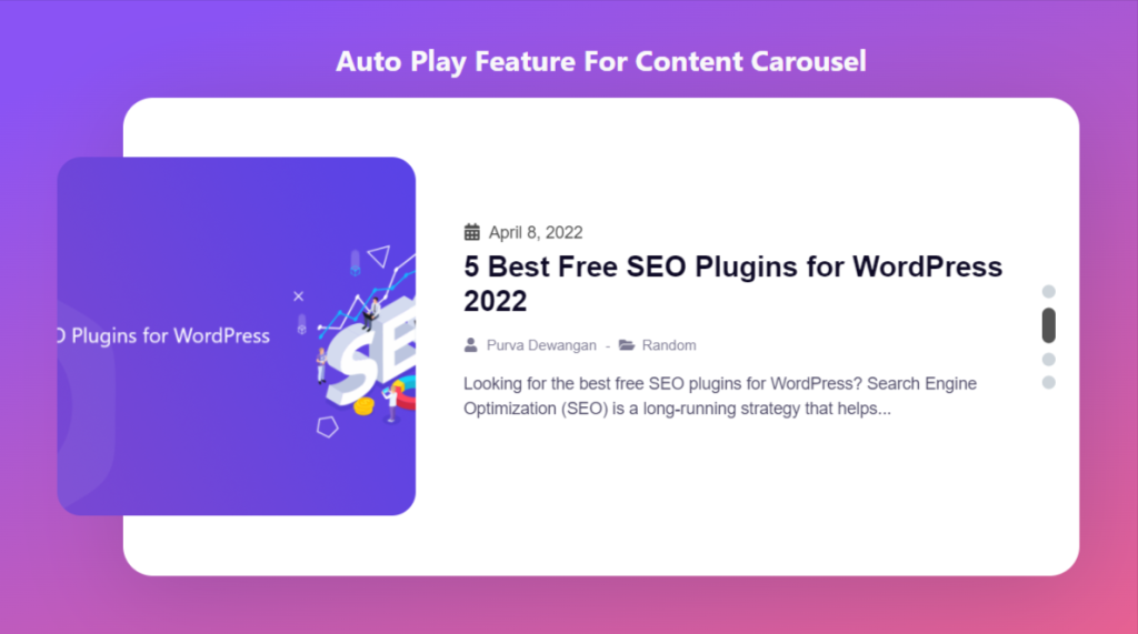
- Autoplay: Toggle on this feature if you want to enable autoplay for the posts displayed in the card slider.
- Pause on Hover: Toggle on this animation feature to hold or pause the post slides when the post is on the focus of the mouse pointer.
- Pause on Interaction: Enable this feature to pause a particular post on a mouse pointer or user’s interaction.
- Autoplay Speed: Adjust the autoplay speed for your posts.
- Infinite Loop: Enable this feature to set a loop cycle for post slides.
- Grab Cursor: It shows the grab cursor when you hover over the slide.
- Pagination: Enable this option to display dots/fraction for your slider.
- Pagination Type: Here, you’ll get options to choose from the pagination type, such as dots or fractions.
- Keyboard Navigation: Enable this feature to use the left or right arrows on your keyboard to scroll through the slides.
Style Tab of the Card Slider Widget
The Style Tab contains all the styling parts of the Card Slider widget. This Tab includes three sections:
- Card
- Image
- Dots
Let’s look at these sections in detail:
Card
This section contains all the styling parts required for the customization of the card.
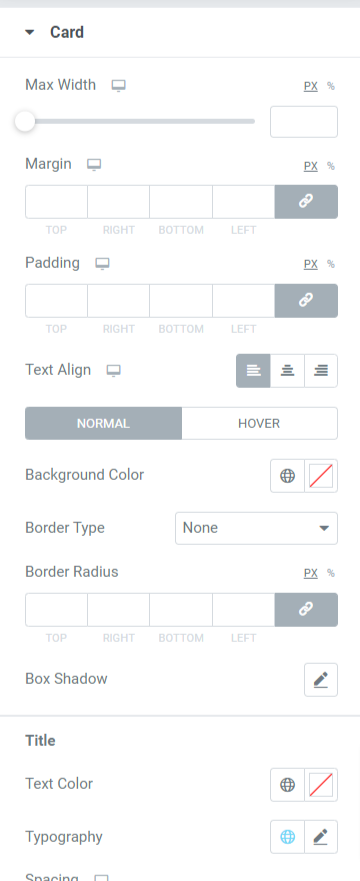
Let’s see all the features available in this section:
- Max Width: Adjust the width of the card slider using this option.
- Margin: Using this option, you can adjust the margin for the card slider.
- Padding: This allows space between the edges and the content. Adjust the padding using this option to display smoothly organized content on the card slider.
- Text Align: Choose the alignment of the text displayed in the card slider.
- Background Color: With this option, you can customize the background color of the post.
- Background Type: Here, you can set a background type for the images. Choose among “gradient” or “classic” to apply a background type.
- Border Radius: You can choose any border type from the options given in this subsection, such as solid, double, dotted, dashed, & groove.
- Border Shadow: You can customize the border shadow using this option.
- Title: Customization options for the title displayed in the post are available here:
- Text Color: Choose a text color for the title using this option.
- Typography: Here, you can customize the text font, text size, word spacing, letter spacing, and many more.
- Spacing: This allows the spacing between texts using this option.
- Date: Customization for the date content displayed in the post can be done here:
- Color: Choose the color for the date content displayed on the post using this option.
- Typography: Here, you can customize the text font, text size, word spacing, letter spacing, etc.
- Spacing: Allow spacing between texts using this option.
- Content: You can customize the content displayed in the post here:
- Text Color: You can choose the text color of the content here.
- Typography: Customize the typography of the content part.
- Post Meta: Post meta customization can be done here:
- Color: This allows you to choose post meta color.
- Typography: A wide range of typography features for the post meta is available in this option.
- Spacing: This allows the spacing between the texts of post meta.
Image
This section allows you to customize the image part of the card slider in all possible aspects.
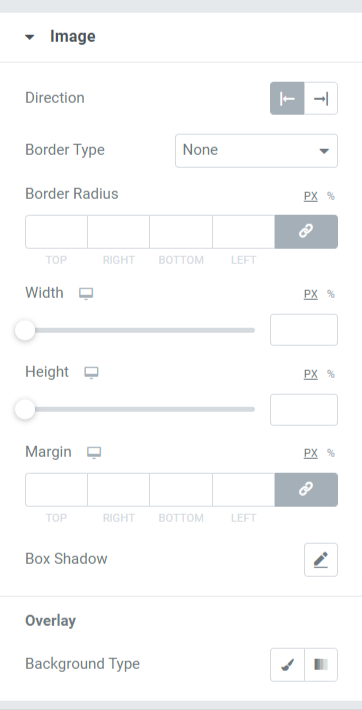
Let’s discuss all the functionalities that this section includes:
- Direction: Using this option, you can select the direction of the image.
- Border Type: You can choose any border type from the options given here such as solid, double, dotted, dashed, & groove.
- Border Radius: You can adjust its radius here if you’ve applied the border.
- Width: Adjust the width of the image displayed in the card slider using this option.
- Height: Using this option, you can adjust the height of the image.
- Margin: This option allows you to adjust the margin of the image.
- Box shadow: Customize the box shadow option for the image displayed in the card slider.
- Background Type: Here, you’ll get the option to select a background type for the image part displayed on the card slider.
Dots
This section will only be available if you’ve selected dots as the pagination type in the additional options section on the content tab of the card slider.
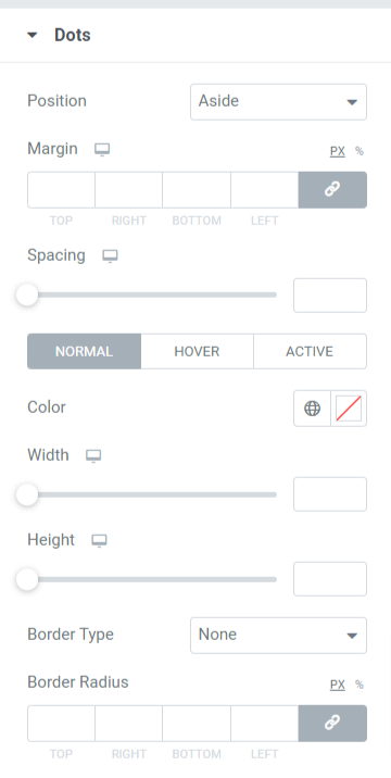
Let’s discover the features available in this section in detail:
- Position: Choose the position type of the dots pagination, such as aside or bottom.
- Margin: Using this option, you can adjust the border margin for the pagination dots.
- Spacing: This feature allows the spacing between the dots.
- Color: You can choose a color for the dots here.
- Width: Adjust the width size of the dots in this option.
- Height: You can adjust the height of the dots here.
- Border Type: Select any border type from the options available such as solid, double, dotted, dashed, or groove.
- Border Radius: You can adjust its radius here if you’ve allowed a border to the pagination dots. It helps display the smooth edges of the border applied.
Let’s see what your card slider looks like after applying all the changes in content tab and style tab of the Card Slider widget:

Get PowerPack Card Slider Widget for Elementor
Using PowerPack Card Slider Widget, you can get tons of features with a single mouse click. Interactively flaunt your content and images in a creative Card Slider format using PowerPack Card Slider Widget for Elementor page builder.
We hope this tutorial will help you create a stunning Card Slider using Elementor for your website. If you’ve enjoyed reading this article, we’re sure you’d also love experiencing our other PowerPack Elements too.
Click here to get the PowerPack Card Slider widget for Elementor.
Please feel free to drop your comments here; we’d love to receive feedback and replies from you.
