
 [Extended] BFCM Sale! Get up to
 With the PowerPack Table of Contents widget, you can add an interactive table of contents section to the blog posts or pages easily using the Elementor page builder.
The PowerPack Table of Contents widget will make it easy for your readers to navigate through the various sections of the content just by a click. Hence, this widget provides your audience with an overview of the page content.
Let’s take a closer look at the content and style tab of the Table of Contents widget.
Content Tab of Table of Contents Widget#
The Content Tab of the Table of Contents widget consists of 3 sections:
- Table of Contents
- Additional Options
- Sticky TOC
- Scroll to Top
- Help Docs
Let us now go over each of these sections in more detail.
Table of Contents#
In this section, you can change the title and choose an HTML Tag for it from the list of options given in the below screenshot.
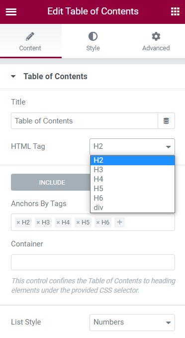
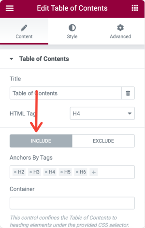
If you want to display only the content with certain heading tags, you can click on the “Include” option and add the tag by clicking on the “+” icon.
If you need to include headings of a particular section, you can copy the CSS Class or CSS ID of that particular container and paste it in the “Container”.
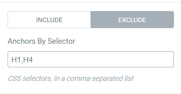
If you need to exclude the particular heading in the table of contents, you need to copy the CSS Class or CSS Id of that heading and add it in the “Anchors by Selector”.
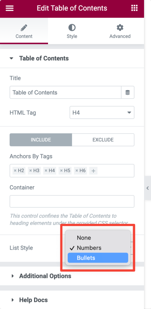
Next, you can select the List Style for your table of contents. You can either choose "Numbers" or "Bullets" style.
Additional Options#
The Table of Contents widget also provides additional options. Let’s take a look at each of the options in detail.
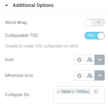
- Word Wrap: Enable the Word Wrap option if you need an automatic break between the end of the content to the beginning of the next content.
- Collapse TOC: Enable the Collapse TOC option, so that your visitors can easily collapse the table of contents with a click.
- Icon: You can choose the icons from the icon library or media library for opening and closing the table of contents.
- Collapse On: You can also set the table of contents to automatically collapse on certain devices such as mobile, tablet, and desktop.
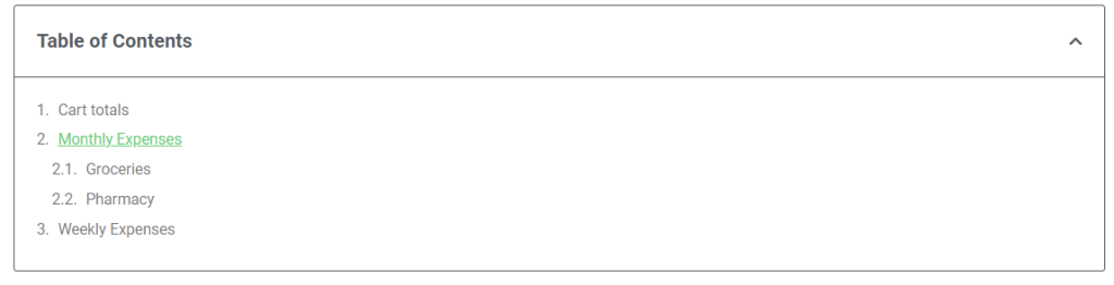
Hierarchical View: Once you enable the hierarchical view, you can collapse the headings of the Table of Contents just by a click. This creates a hierarchy of contents as shown below.
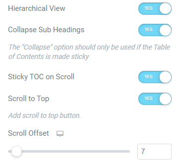
- Sticky TOC on Scroll: If you want to add a sticky table of contents on your page, you can enable the Sticky TOC on Scroll option. With this option, when you scroll down to the page, the table of contents will appear in the position you want it to appear on.
- Scroll to Top: You can enable the “Scroll to Top” option if you want to scroll the table of contents vertically.
- Scroll Offset: You can also set an offset for the scroll by dragging the slider.
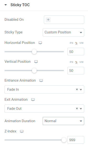
Sticky TOC#
The Sticky TOC section appears only when the "Sticky TOC on Scroll" option is enabled. This section consists of several options. Let’s go through each option in detail.
- Disabled On: In this section, you can disable the sticky table of contents on certain devices like mobile, tablet, and desktop.
- Sticky Type: You can choose a “Custom Position” where your sticky table of contents needs to appear or choose “Sticky in Place” allowing it to appear in the default position.
- Horizontal Position: You can set the horizontal position for the sticky table of contents.
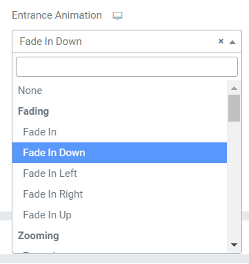
- Vertical Position: You can also set the vertical positions for the sticky table of contents. Animation: Further, you can add an “Entrance” and “Exit” animation to the sticky Table of Contents from the options available in the drop-down menu as shown in the below screenshot.
- Animation Duration: You can change the speed of animation added to the Sticky Table of Contents by choosing the duration as “Fast” or “Slow”. By default, it will be displayed with a “Normal” speed.
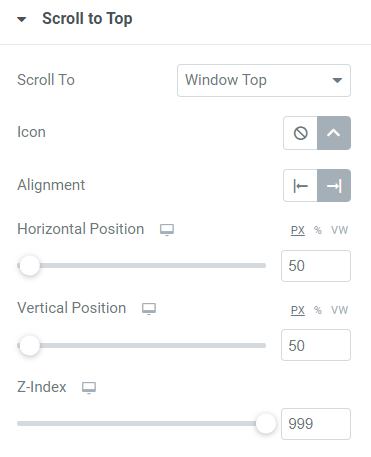
Scroll to Top#
This section appears only when the "Scroll To Top" option is enabled. In this section, you can scroll to the “Windows Top” or to the “Table of Contents” just by clicking on the icon. You can choose this icon from the icon library and align it to the Left or Right bottom of the page. You can also set the horizontal and vertical positions of the icon by dragging the slider.
Also Check: How to exclude headings from the Table of Contents?
Now, let’s go through the style tab of the Table of Contents widget.
Style Tab of Table of Contents Widget#
There are 5 sections in the style tab of the Table of Contents Widget:
- Box
- Header
- List
- Sticky TOC
- Scroll to Top
Let's look at each of these sections in more detail.
Box#
In this section, you can change the background color of the Table of Contents box and choose a border type for it from the drop-down list given in the below screenshot.
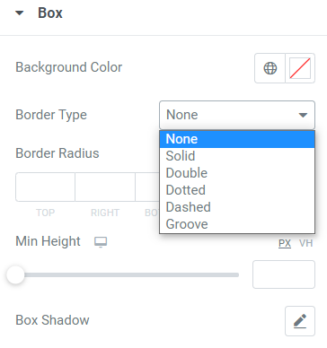
It is also possible to choose a border color for the Table of Contents, set a width for the border, and set the border-radius. You can further set the minimum height for the Table of Contents box and add a box shadow to it.
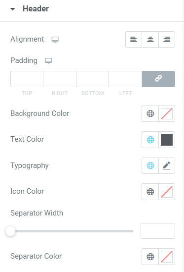
Header#
In this section, you can set the typography for the header of the Table of Contents and align the header to the Left, Right, and Center. It is also possible to set the padding to adjust the space between the header and the list.
Also, you can choose a background color and text color for the header. You can set the width between the header and the list just by dragging the slider. Further, you can add color to the separator and the icon of the header.
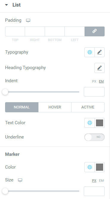
List#
In this section, you can change the typography of the headings. There are several options available in the list of table of contents which can be used on “Normal”, “Hover”, and “Active modes”. It is possible to set the font size for each level of heading tags added to the list as shown in the below screenshot.
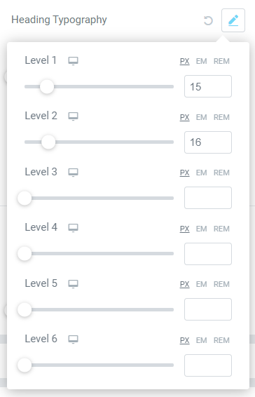
You can also set the indent between each level of heading tags in the list. Further, you can choose a “Text color” and “Marker color”(Say it bullets and numbers) for the content in the list. You can also change the size of the bullets and numbers in the list.
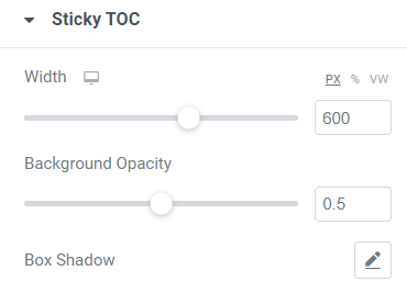
Sticky TOC#
In this section, you can set the width and background opacity for the Sticky Table of Contents. It is also possible to add a box-shadow to it.
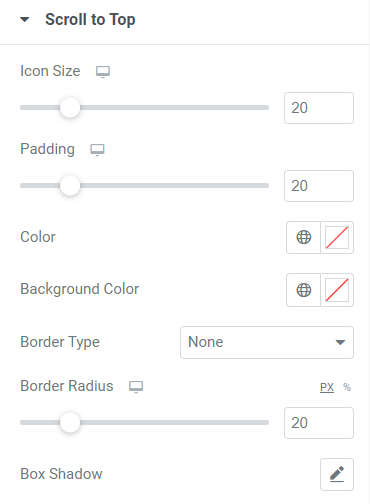
Scroll to Top#
You can set the size and padding for the icon at the bottom of the page. It is also possible to choose the color for the icon and also set a background color for it.
Further, you can choose a border type from the list of options such as Solid, Double, Dotted, Dashed, and Groove. You can also set the border-radius to soften the sharp edges of the icon and add a box shadow to it.
This was the detailed overview of the Table of Contents Widget available in PowerPack Addons for Elementor.
Hope this helps!