
 [Extended] BFCM Sale! Get up to
 1. Add Table Headers#
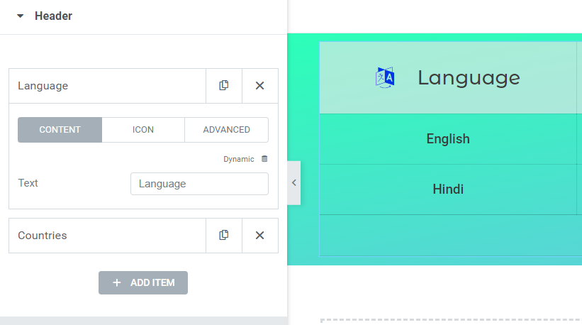
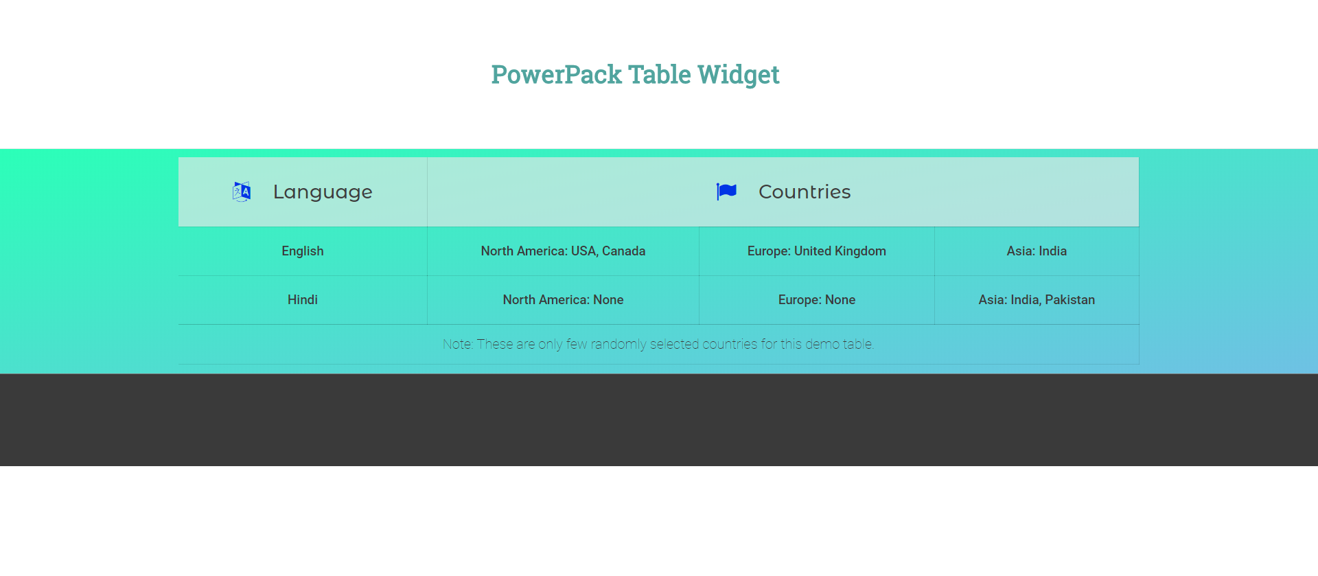
Drag a new Table Widget to the page and select the Header section under the Content Tab. Start adding the Table Headers as required.
2. Add Body Content#
There are two steps in adding the body content to the table.
First, add a Table Row element to the table. This element identifies the starting of a Table Row and adds the upcoming cells to this row until a new Row Element is encountered in the list.
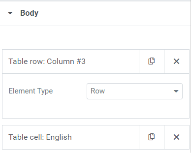
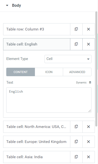
Second, start adding Table Cells as per your requirement. For example, in this demo, I have added 4 cells per row.
Notes:
There are 3 options available in both Table Cell and Table Header elements.
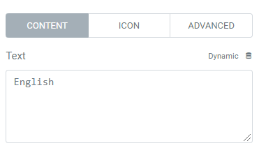
1. Content: Content Tab is used to add data to the cells. This data can be text or raw HTML.
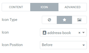
2. Icon: Icon Tab provides an easy option to add an icon from the icon library or a custom image to the cell.
3. Advanced: Advanced can be a very useful section when used wisely. It provides you with three different sub-options.
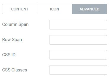
a. Column Span is used for extending a cell to number to columns defined. For example, if you need a cell to extend to two columns, the column span would be 2.
b. Row Span is similar to the Column Span except that it extends the cell vertically to multiple rows (or vertically).
c. CSS ID is used to add custom CSS ID to the cell so it can be styled using custom CSS.
d. CSS Classes is used to add custom CSS Class to the cell so it can be styled using custom CSS. This can be useful when you want multiple cells to be styled similarly.
3. Adding Table Footer#
Table Footer can be added in the same way as Table Header. These are useful in displaying additional notes, important information regarding the table data, links to its sources, etc.