
 [Extended] BFCM Sale! Get up to
 Logo Carousel widget is used to display multiple logos in a carousel manner. This is used mostly to display the renowned users, sponsors, etc., to build trust with the users.
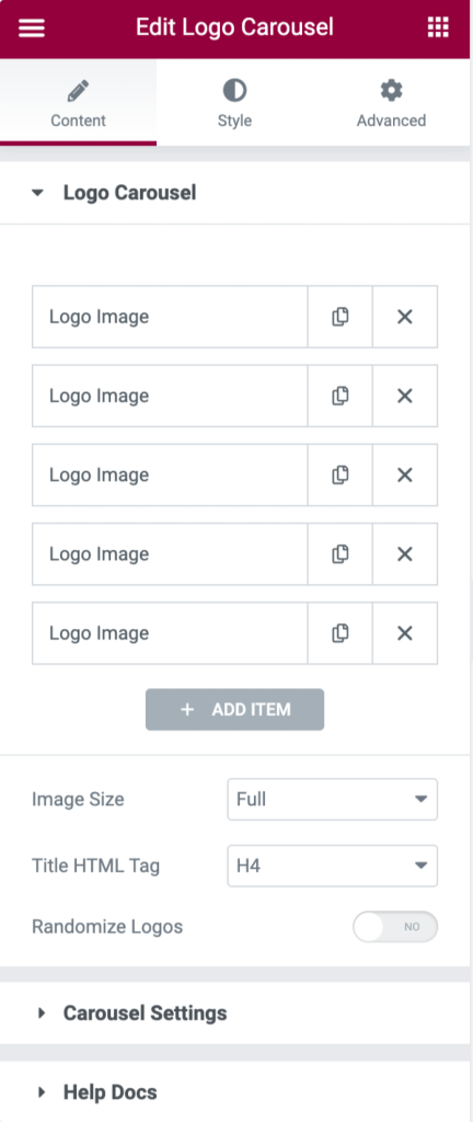
Content Tab of Logo Carousel Widget#
Here you can add a logo image with a title and logo to it. You can add a custom link to each one as well. You can enable and disable navigation arrows and the dots. You can change the number of visible items, the gap between 2 items, auto play speed of the slider, and enable/disable other options like to show on an infinite loop and whether to display grab cursor or not.
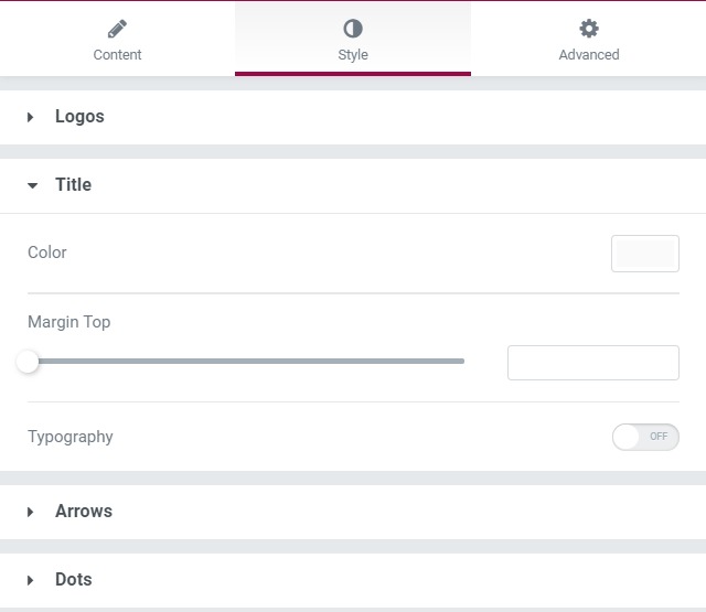
Style Tab of Logo Carousel Widget#
All the styling is done from this box only. You can change the height, border, alignment, and padding, and can align the logo. You can change the typography and color of the heading. You can also make changes to how your arrows and the dots look in terms of size, color, spacing, border, and margin.
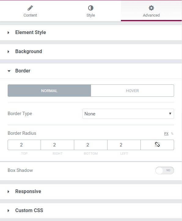
Advanced Tab#
This Tab has five subsections-
- Element Style - Here, you can change the margin, padding, z-index, and entrance animation and add CSS ID and classes.
- Background - Here, you can set the background as classic or gradient and can even add the hover effects.
- Border - Here, the properties related to the border are defined as border type, radius, box-shadow, and hover effects.
- Responsive - Here, you set the responsiveness of the different devices to be active or not.
- Custom CSS - This lets you add CSS code to the widget, and you can see it render live right in the editor.