
 [Extended] BFCM Sale! Get up to
 Info Box widget adds an information box that can be used to add a chunk of information to the page. There are many modifications that can be made to the infobox.
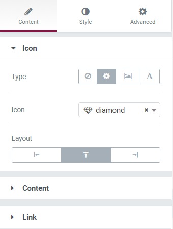
Content Tab#
The content has three subsections-
- Icon - Here, you can change the Icon type, alignment, and icon.
- Content - Here, you can change the title, subtitle, and description. You can also choose the HTML tag for the heading and the subheading.
- Link - Here, you can set the whole box, title, or button as the entire link.
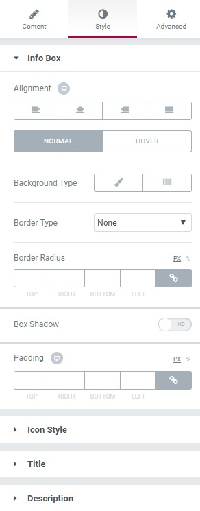
Style Tab#
You can change the background, text color, font style, border color, border radius, typography, line height, font family, etc. via this tab.
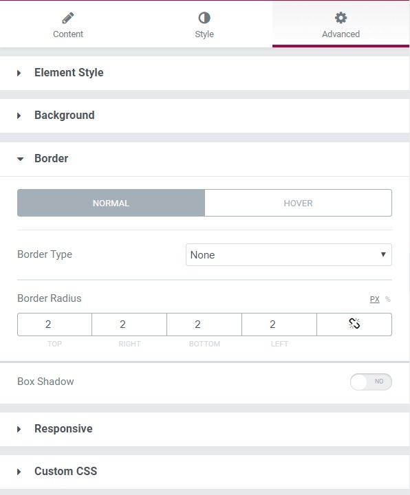
Advanced Tab#
This Tab has five subsections-
- Element Style - Here, you can change the margin, padding, z-index, and entrance animation and add CSS ID and classes.
- Background - Here, you can set the background as classic or gradient and can even add the hover effects.
- Border - Here, the properties related to the border are defined as border type, radius, box-shadow, and hover effects.
- Responsive - Here, you set the responsiveness of the different devices to be active or not.
- Custom CSS - This lets you add CSS code to the widget, and you can see it render live right in the editor.