
 [Extended] BFCM Sale! Get up to
 Modal Popup Widget is used to display information in the form of a popup. You can show a photo, video, page, text, or custom HTML. Many alterations can be done in this box.
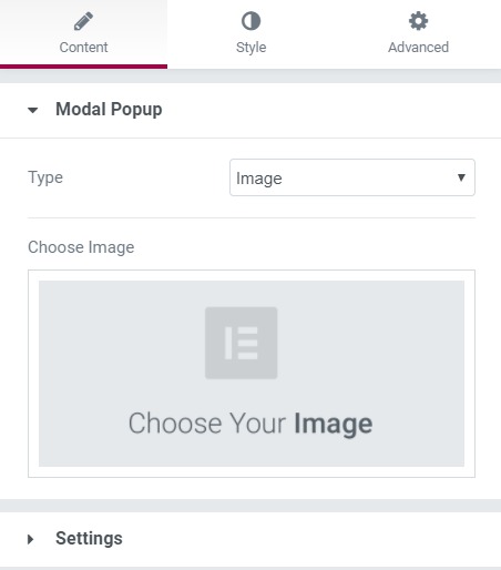
Content Tab#
Here, you can decide what you want to show when the modal link or box is triggered. You can show a photo, video, link, template, or HTML. In the settings subsection, you can decide how you want to trigger the modal box, such as when the page loads or when the user moves the cursor out of the window, or when a link or button is clicked.
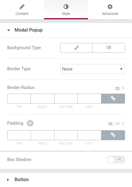
Style Tab#
All the designing parts are taken care of by this section. You can change the background, border, alignment, padding, and box shadow. If you set the trigger as a button, you can also change the button properties, such as background, padding, text, typography, etc.
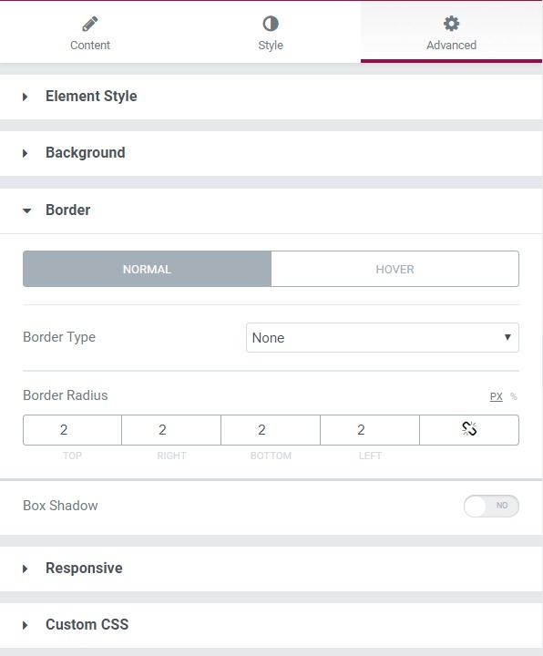
Advanced Tab#
This Tab has five subsections-
- Element Style - You can change the margin, padding, z-index, and entrance animation and add CSS ID and classes here.
- Background - Here, you can set the background as classic or gradient and add hover effects.
- Border - Here, the properties related to the border are defined as border type, radius, box shadow, and hover effects.
- Responsive - Here, you set the responsiveness of the different devices to be active or not.
- Custom CSS - This lets you add CSS code to the widget, and you can see it render live right in the editor.
Check out the Demo.