
 [Extended] BFCM Sale! Get up to
 Icon list widget shows a list of custom icons with text that is used in many situations and places over the web. You can even use an image as an icon there as well.
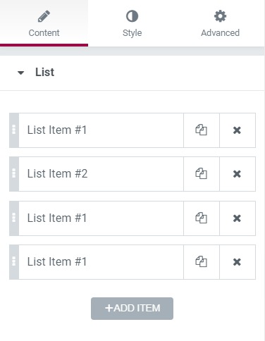
Content Tab#
The Content tab assists in making a list and selecting the list, and editing the content of the list. You can even change the contents of the list and select an image as an icon for the same.
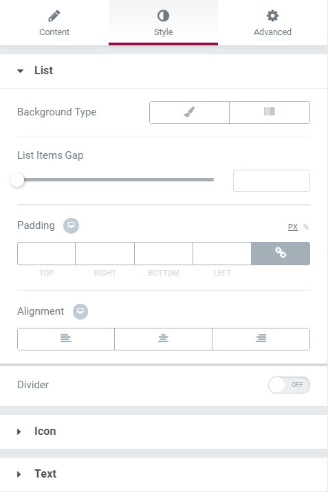
Style Tab#
This tab helps in changing the font style, typography, text color, padding, margin, background, alignment, and border.
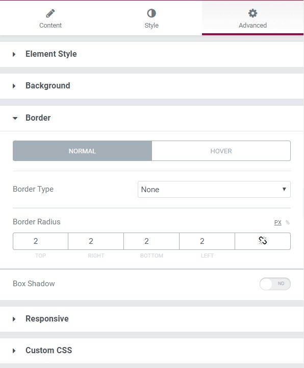
Advanced Tab#
This Tab has five subsections-
- Element Style - Here, you can change the margin, padding, z-index, and entrance animation and add CSS ID and classes.
- Background - Here, you can set the background as classic or gradient and can even add the hover effects.
- Border - Here, the properties related to the border are defined as border type, radius, box-shadow, and hover effects.
- Responsive - Here, you set the responsiveness of the different devices to be active or not.
- Custom CSS - This lets you add CSS code to the widget, and you can see it render live right in the editor.